

Every design decision I make starts the same way. I picture the problem the user needs to solve. I envision the information they will need to solve it. I think about the information the user needs presented at each step. I picture their journey, lay out three or four design options. These four options become the titles of my four prototypes. I quickly test a low-fidelity design, eliminate two options, and refine the remaining user experiences.
The mental model is the hypothesis. Then I test it.
Eighteen years of A/B and multivariate testing have taught me that the data is almost always right. When a test contradicts the design, the data is not wrong. My model of the user has a gap. The job is to find what is missing.
When the data agrees, something quieter happens. Cognitive load drops. The user finds what they need faster. They scroll less, think less, choose faster. That is the goal.
The Netflix household
In 2011, I was on the International Expansion team at Netflix during the DVD-to-streaming transition. We were building Netflix XP, the experimentation platform that would become foundational to the company’s design culture.
One question kept coming back. How do you recommend content to a household with four people who want different things?
The mental model was straightforward. A Netflix account does not serve one person. It serves a family. Dad watches action. Mom watches drama. The kids want animation. Everyone wants something to watch together on Saturday night.
The default approach aggregated everyone’s history into one row of recommendations. The result was muddled. Dad’s action got diluted by kids’ animation. Kids’ animation got diluted by Mom’s dramas. Nobody saw what they wanted in the first row, so everyone scrolled. The cognitive load was the scrolling.
The obvious solution was per-person profiles. We could not ship them everywhere. At the time, Apple TV enforced a 20 MB cap on app binaries, and adding profiles would have pushed the Netflix app past it. There was one profile per Netflix account. The mental model had to work for the whole living room, on a single profile, without asking who was watching.
The hypothesis: shuffle the feed. Interleave suggestions across the household so the rows offered something for Dad, then something for the family, then something for Mom, then something for the kids, then something for the family again. Keep mixing. Anyone in the room sees something for them within a few rows. Engagement stays distributed.
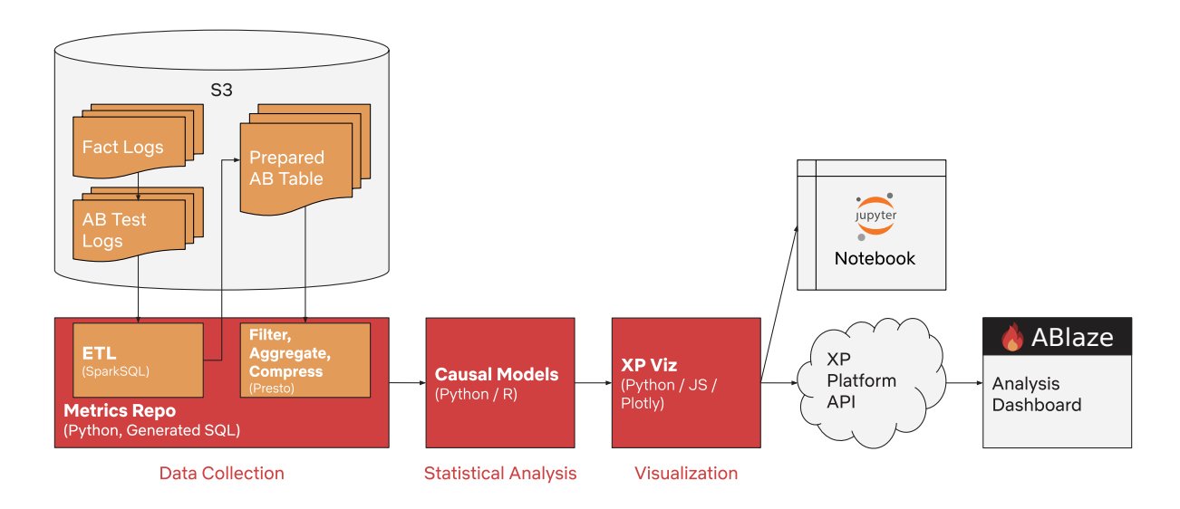
We built four variants. Variant A was the aggregated control. Variant B was the shuffled household feed. Variant C used explicit profiles, tested on the surfaces that could support it. Variant D shifted recommendations by time of day. 250,000 users per variant. Four weeks. Click-through rate, viewing time, content completion, satisfaction surveys.
Variant B won. Content discovery rose 23 percent. Viewing time per session rose 18 percent. Household satisfaction rose 31 percent.
The line in the post-test report I still think about: users reported less time browsing and more time watching. That is cognitive load reduction, measured.
The mental model was right. The data confirmed it. The whole living room got there faster.
The method
The method is not complicated. It is just deliberate.
I visualize the full journey before I open Figma. I name what the user knows when they arrive. I name what they need to decide. I name the smallest set of choices that gets them through. The simulation is the hypothesis.
Then I write the test. The test has to be capable of disproving the hypothesis, or it is not a test. I pick a primary metric that maps to the user goal, not to my preference. I set the sample size with the data team so we are running to significance, not to a date.
When the data confirms, I ship. When the data disagrees, I do not argue with the data. I look for what my model missed.
A plumber does not argue with a clogged drain. The plumber checks the trap first. The trap is dry, the seal is broken, water is going where it should not. The fix is mechanical, and it was in front of you the whole time. Failed tests work the same way. The user was carrying context I did not account for. A constraint, a fear, a habit, a piece of the screen I treated as obvious that was not. The redesign closes the gap.
The Self-Service Portal
The same pattern showed up at TeleSign with the Self-Service Portal.
Enterprise onboarding took 67 days. Customer success teams handled every step manually. The mental model going in was that enterprise customers would self-provision if the tools matched the trust model their compliance teams already used. They wanted control. They wanted speed. They wanted to onboard on their own schedule.
The hypothesis: build a portal that gave them API keys, billing visibility, and phone number provisioning without the human handoff.
The test was the rollout itself. We measured onboarding time, CS team workload, customer satisfaction, and revenue per account.
The data confirmed it. Complex government-regulated configurations dropped from 67 days to 35. Standard products went same-day. Eighty-five percent of new customers went live without CS intervention. Daily transaction revenue went from 500,000 dollars to over 2 million.
The cognitive load reading is the part that gets buried. The CS team stopped fielding the same questions thirty times a week. The customer stopped wondering where in the queue their request was. Both sides of the relationship got their attention back.

What eighteen years of testing has taught me
The mental model leads. The data confirms.
When the model is right, the user finds what they need with less effort. The page does less work to be understood. The path narrows. Choices feel inevitable rather than arrayed.
When the model is wrong, the data shows me what the user was actually carrying that I did not see. That is the more valuable result. A failed test is the gap in my understanding, surfaced.
This is the part of the work I find most satisfying. Forming the model, putting it in front of users, watching the data either confirm it or show me the trap I missed. Both outcomes move the design forward. Both outcomes lower cognitive load for the people who eventually use the thing.
Statistical significance is not an obstacle to design intuition. It is the proof the intuition was worth having.