

The User Who Knows More Than You
Most UX work is premised on the idea that the designer understands the product better than the user. We simplify. We guide. We progressively disclose complexity so the user does not have to confront it all at once.
Expert users break this model completely.
At TeleSign, I spent years designing interfaces for fraud analysts. These are people who make hundreds of decisions per day about whether a phone number is legitimate. They know more about fraud patterns than any designer will ever know. They have built intuitions about carrier behavior, SIM swap signatures, and synthetic identity patterns that take years of hands-on work to develop.
My job was not to simplify their world for them. My job was to make sure the machine did not slow them down.
This is a fundamentally different design problem, and I think it is one of the least-discussed categories in UX writing.
What the Machine Was Doing
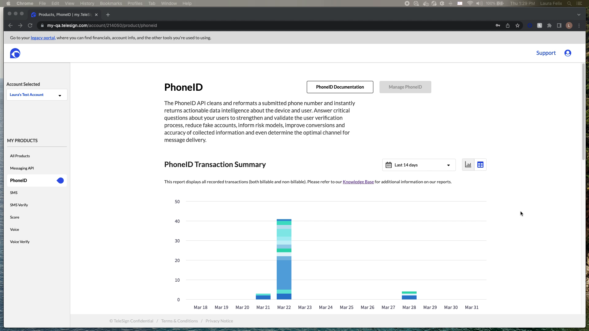
TeleSign’s phone number reputation scoring system analyzed 1,000+ data points and 2,200+ digital identity signals to produce a risk score from 0 to 1,000. The system ran in real time at sub-second response times for 5+ billion unique phone numbers per month. It protected 21+ billion annual transactions.
The ML was doing work that would have been impossible for a human analyst to replicate manually. The problem was that fraud analysts had to act on the output of that machine without always being able to see inside it. A black box ML system creates a specific and serious UX problem: it asks expert users to trust a recommendation they cannot verify.
Before the interface I designed, analysts described their daily work like this: “We see thousands of account creation attempts daily. Some are clearly fraudulent. Others look suspicious but we’re not sure. We need to make split-second decisions about who to allow, who to flag for review, and who to block immediately.”
And the problem was not just speed. It was false positives. When you block a legitimate user, you lose them. You damage the relationship. You generate a support ticket and potentially a refund. False positives have a real cost, and expert fraud analysts are acutely aware of it.
The Design Problem, Stated Precisely
I needed to build an interface that let an expert fraud analyst process a case, understand the machine’s reasoning, make a confident decision, and move to the next case. The speed constraint was real: analysts were processing hundreds of cases per day. Two to three minutes per case was the pre-interface benchmark. The target was 30 seconds.
That is a 4x to 6x improvement in decision velocity. Achieved not by making the analyst smarter, but by putting the right information in the right place at the right moment.
- Show reasoning, not just output. The score is 743. Why is it 743? The analyst cannot trust a number they cannot interrogate.
- Surface the signals that matter most for this case. Not all 1,000+ parameters. The 5 to 10 that are doing the most work for this specific number.
- Enable threshold tuning without requiring a developer. Different clients have different risk tolerances. A fintech company and a food delivery app do not have the same acceptable false positive rate.
- Make actions one step, not three. Allow, flag, block. Each should be a single keystroke or click from the main view.
Making Machine Learning Transparent
The hardest design challenge in this project was not information architecture or visual hierarchy. It was deciding how to present the machine’s reasoning in a way that felt trustworthy rather than overwhelming.
The system analyzed things like: SIM swap history, number porting patterns, breached data exposure, active call patterns, VoIP vs. landline vs. mobile classification, IP location mismatch against carrier location. Each signal had a contribution weight to the final score. Showing the raw contribution weights was technically accurate and practically useless. Analysts did not think in weights. They thought in categories.
The solution was a visual breakdown of the six risk categories, each showing its contribution to the total score in plain language, with the specific signals driving the highest-contribution categories expandable below. The analyst saw the summary first. If something looked unusual, they expanded it. If the summary told the story clearly enough, they made the decision without going deeper.
This is progressive disclosure in expert context: not hiding complexity from someone who cannot handle it, but surfacing complexity on demand for someone who knows exactly what they are looking for.
Designing for the False Positive Problem
Every fraud prevention system has two failure modes. False negatives let fraud through. False positives block legitimate users. Both cost money. The relationship between them is a dial, not a binary, and different organizations need to tune it differently.
A financial services client blocking high-risk numbers saw a 73% reduction in fraudulent account creation in the first quarter. They also needed to be able to tune sensitivity downward as they built confidence in the system, because an overcalibrated fraud prevention system destroys acquisition. One e-commerce client stopped a synthetic identity fraud ring that the interface helped surface: a pattern of newly activated phone numbers from the same carrier with similar registration timestamps and suspiciously low usage history. A ride-sharing client reduced promotion abuse by 89% by flagging prepaid and VoIP numbers with abnormal messaging patterns.
But in each case, the threshold controls were as important as the detection. I designed reporting that showed false positive rates, false negative rates, and decision outcome tracking over time. Clients could see the consequences of their threshold settings and adjust. This turned the interface from a recommendation engine into a learning system.
Speed as a Design Requirement
The 30-second decision target was not aspirational. It was operational. A fraud analyst handling 400 cases per day at 30 seconds per case is spending 3.3 hours on case review. At 2 minutes per case, they spend 13 hours. The case volume is fixed. The interface determines whether the analyst can do their job in a workday or whether they go home with a backlog.
This shaped every small decision. Keyboard shortcuts for allow/flag/block. Score displayed at the largest type size on the page. The top three contributing signals visible without scrolling. Batch processing for cases that shared the same risk signature.
One analyst described the impact: “I used to spend 2 to 3 minutes investigating each suspicious account. Now I see the score breakdown and make a decision in 30 seconds.”
That is a 5x improvement in throughput per analyst. At scale, across a team of fraud analysts working on a platform processing 21 billion annual transactions, that velocity difference is the difference between a team that keeps up and a team that falls behind fraud.
What Designing for Experts Taught Me
Working in this domain for five years changed how I think about complexity in product design.
The standard UX principle is: reduce cognitive load. That is correct for almost every context. But there is a category of user for whom cognitive load is the job. Fraud analysts think through complexity to reach accurate decisions. A simplified interface that removed the signals they needed to think through would not feel easier to them. It would feel unreliable.
The right principle for expert users is different: surface the right complexity at the right moment. Not less complexity. The right complexity, organized so the expert can move through it quickly and confidently.
Designing for experts also requires a specific kind of research humility. I never knew as much about fraud patterns as the analysts who used the system daily. My job was to understand what decisions they were making and what information they needed to make those decisions well. The domain knowledge stayed with the experts. The interface knowledge stayed with me. That division of labor is what made the collaboration work.