

The Confession
Early in my career, I measured my own effectiveness by the quality of what I shipped. Did the screens look good? Was the interaction model clean? Did the engineers build it close to spec? Those were my metrics. They felt like the right ones.
I was wrong. Not entirely wrong. Craft matters. Execution matters. But I was measuring the work, not the impact of the work. And those are different things in ways that took me years to fully understand.
Here is what I mean, and why I think this confusion is more common than the design industry acknowledges.
Output: What You Made. Outcome: What Changed.
Output is the design artifact. The wireframe. The component. The flow. The shipped feature. Output is what you can put in a portfolio and point to.
Outcome is what happened because of the artifact. Did onboarding time drop? Did conversion increase? Did fraud analysts process more cases? Did students complete applications at a higher rate? Outcome is what the business cares about. It is also what users experience, though they usually do not have language for it.
The confusion between these two things is institutional. Design teams are typically resourced around output. You are hired to produce screens. You are evaluated on design quality, delivery speed, and stakeholder satisfaction with the artifact. The connection between that artifact and a measurable downstream change in user behavior is often nobody’s explicit job to track.
This is how you end up with beautiful work that does not move the needle.
The Netflix Lesson: Trust Nothing, Including Instinct
I was at Netflix during the international expansion, working within the Netflix XP experimentation platform. The thing that changed my thinking most was not any particular test result. It was the posture of the organization toward design decisions.
At Netflix, the assumption was that you did not know whether your design was better until you measured it against a population of real users. Not a user research panel. Not a usability test with eight participants. Millions of users, in market, choosing between version A and version B with their actual behavior.
This was initially uncomfortable. I had opinions about which designs were better. Some of those opinions were informed by years of experience and pattern recognition. Some of them were just wrong. The data told me which was which, and it was not always the answer I expected.
The principle I internalized: animations and transitions should only exist if you can prove via A/B testing that user engagement increased to a degree of statistical significance. If not, it is noise distracting the user from achieving their goal. This sounds obvious. It is a principle that most design organizations never operationalize.
The experimentation culture Netflix built during that period is still in use today. That is the outcome of that work. Not the individual screens that were designed and tested and revised. The cultural and operational infrastructure for continuous measurement.
The Appily.com Lesson: The Number Tells You When You’re Right
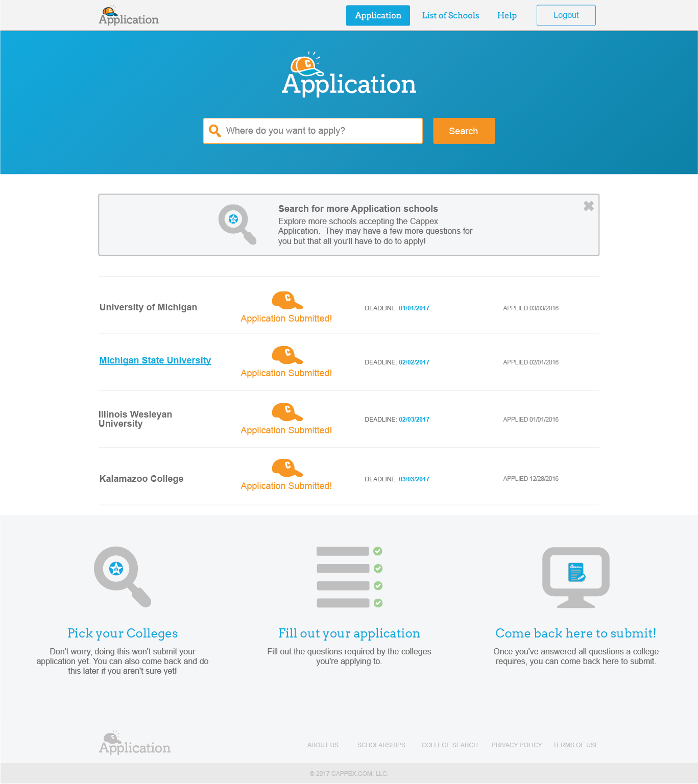
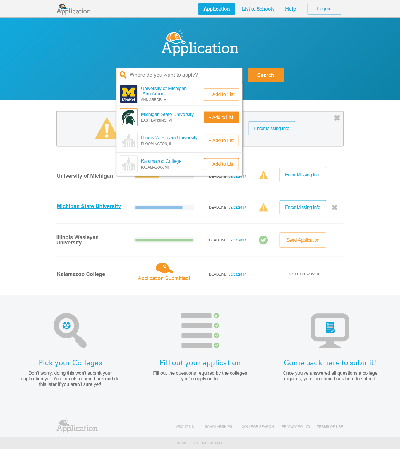
At Cappex (now Appily.com), I was working in an organization that used A/B testing and multivariate experiments as a routine tool, not an exceptional one. We had a lead statistician. Decisions about design changes went through hypothesis formation, test design, statistical analysis, and a decision about whether the result was significant enough to ship.
The Universal College Application achieving a 47% completion rate against a 20–35% industry benchmark did not feel like a win when I was in the middle of building it. It felt like a series of iterations, some of which worked and many of which did not. The college selection interface failed usability testing twice before we got it right. Deadline visibility was a problem we did not identify until mid-process testing revealed students were missing important information.
The number at the end validated the process, but it also revealed something more important: we hit 47% because we measured everything. We tracked completion rates per step, not just overall. We knew exactly where students dropped off and why. We iterated against specific failures, not general impressions.
When you design without measurement, you are navigating without a map. You can build something that looks right and works reasonably well. You cannot know whether it is as good as it could be, because you have no feedback loop telling you what “good” means in practice for your specific users.
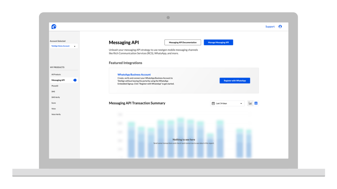
The TeleSign Lesson: Design Is Infrastructure
At TeleSign, the product processed 21 billion annual transactions. That number changes the stakes of design decisions in a way that is difficult to fully internalize until you are inside it.
Ninety percent of the six-digit verification codes you receive on your phone come from TeleSign APIs. When you get a login code from your bank, a ride confirmation from Uber, or a package notification from Amazon, there is a significant probability that a UI I designed was part of the infrastructure that made it happen. Not visible to you. Not something you would ever attribute to a product designer. But present.
This taught me that outcome at scale is almost never visible to the user. The outcome of the fraud prevention interface is that millions of legitimate users were approved instantly without knowing they were being evaluated. The outcome of the self-service portal is that Fortune 500 engineering teams went live in 35 days instead of 67, without knowing that 67 days was ever the baseline.
Good infrastructure is invisible. Good design at scale is the same way. The measure of success is not how often users notice the design. It is how rarely they need to.
What Changes When You Measure Outcome
I want to be specific about what actually changes when a design organization shifts from measuring output to measuring outcome.
- Prioritization becomes objective. When you can connect a design change to a measurable user behavior, you can make a case for building it that does not depend on stakeholder intuition. The TeleSign portal moved from proposal to funding in part because I could quantify the cost of the status quo: 40% of CS team time on tasks that could be automated, multiplied by fully-loaded cost, divided by the story points required to build the alternative.
- You stop defending the wrong work. When you measure outcome, you find out faster that a direction is not working. This is uncomfortable in the short term and valuable in every other way. The design directions I abandoned at Cappex after testing failure freed up time for the iterations that eventually worked.
- The conversation with engineering changes. When you show up to a sprint planning meeting with a hypothesis attached to the design request, you are a different partner than someone showing up with a mockup and a preference. Engineers respond differently to “we think this will reduce drop-off by 15% based on heatmap analysis and the two previous tests” than they do to “the current design feels confusing.”
- Your portfolio writes itself. If you measured outcome, you have the numbers. The case study headline is already there. You just have to tell the story that connects the design decision to the result.
The Honest Caveat
Not every design decision can be measured. Some things matter and are not measurable. Brand coherence. Accessibility for users who are not large enough in your user population to show up in a statistical test. The experience of a user who encounters an error state once in five years. These things are real. They do not always produce a number.
The principle is not “only do work you can measure.” The principle is: build the habit of asking what would change if the work is successful. If you cannot answer that question, you do not have a clear enough problem definition to start designing. Go back and sharpen the problem.
Design is not decoration. It is intervention. Every intervention has a hypothesis embedded in it, even when that hypothesis is implicit. Making it explicit is the difference between a designer who ships and a designer who builds things that matter.