
The fastest players never saw their scores.
That was the first playtest finding on the Superstrike Challenge, a click speed test I designed for Logitech G’s trade show booths. A player finishes the ten second test at eight clicks per second. The test ends. Their finger does not. The next click lands on the results screen, the game restarts, and the score they came for is gone.
The commissioning client was Kamp Grizzly, a Portland creative agency, promoting the Logitech G PRO X3 SUPERSTRIKE mouse. The deliverable was a gamified kiosk for the booth floor. The stakes were attention: a kiosk earns roughly three seconds from a passing visitor, and a visitor who never sees their score has no story to tell at the booth.
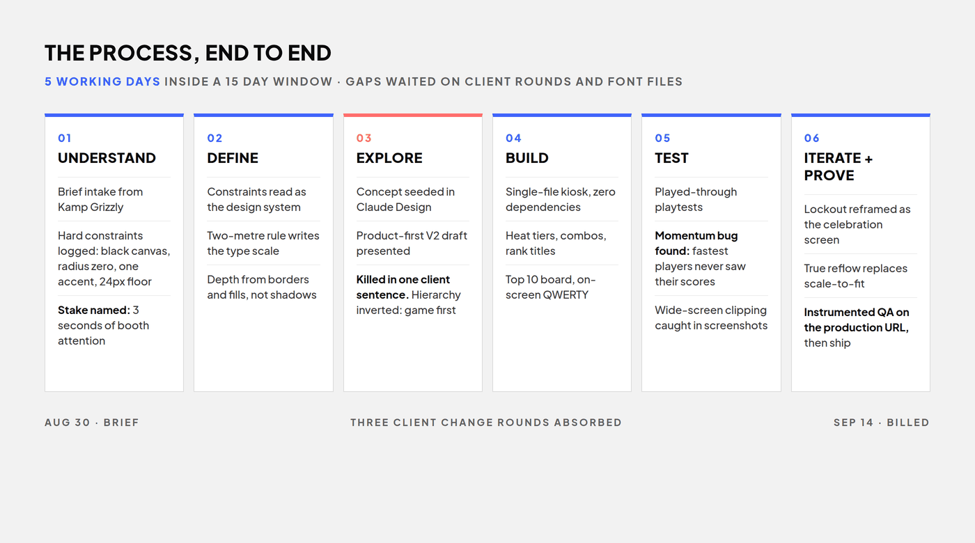
Fifteen calendar days, brief to billed. Five of them were working days; the rest idled while client rounds and font files came back. This is what happened inside the five, out of order, the way the project happened to me.
The brief was a list of prohibitions
The brief arrived with hard constraints. 1920x1080, always horizontal. Black canvas. One accent color. Radius zero. No drop shadows. Condensed uppercase display type. Nothing under 24px, readable from two metres. Mouse only. No accounts, no text entry.
You could read a list like this as handcuffs. I read it as the design system, delivered early.
Depth came from borders and fills instead of shadows. Hierarchy came from scale and a single accent. The two-metre readability rule alone wrote the entire type scale. The finished kiosk reads as brand discipline, not limitation.
The direction Kamp Grizzly killed
The first V2 draft led with the product. A plate panel with studio renders, a marketing ticker, a three-cell data HUD. Client review killed it in one sentence: it felt like shoving the mouse in the user’s face, not a fun game.
They were right, and I am glad the feedback was blunt. The rebuild inverted the hierarchy. The game became the hero. Branding framed the game instead of competing with it. Product presence shrank to a footer line and one small render.
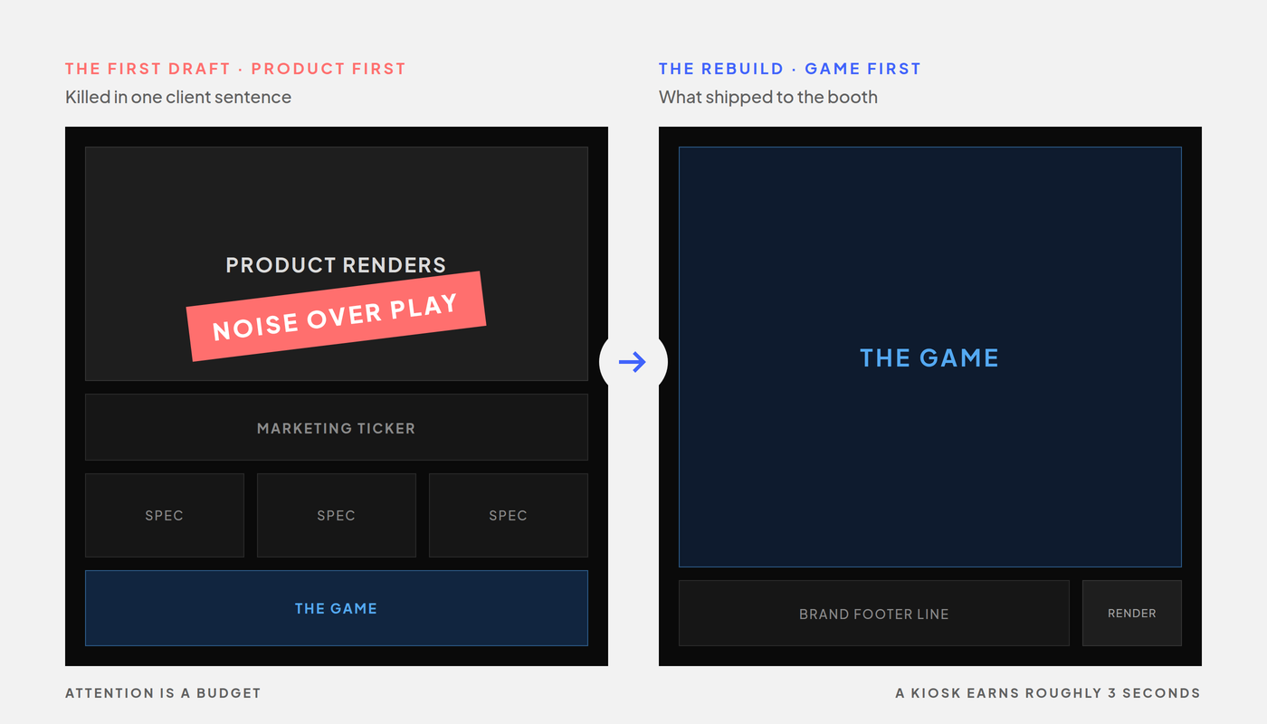
Here is the thing about a booth floor. Attention is a budget. Spend your three seconds on marketing copy and you lose the visitor. Spend them on one question, how fast can you click, and the visitor becomes a player. A player absorbs the brand through the experience itself.
The wrong fix shipped first
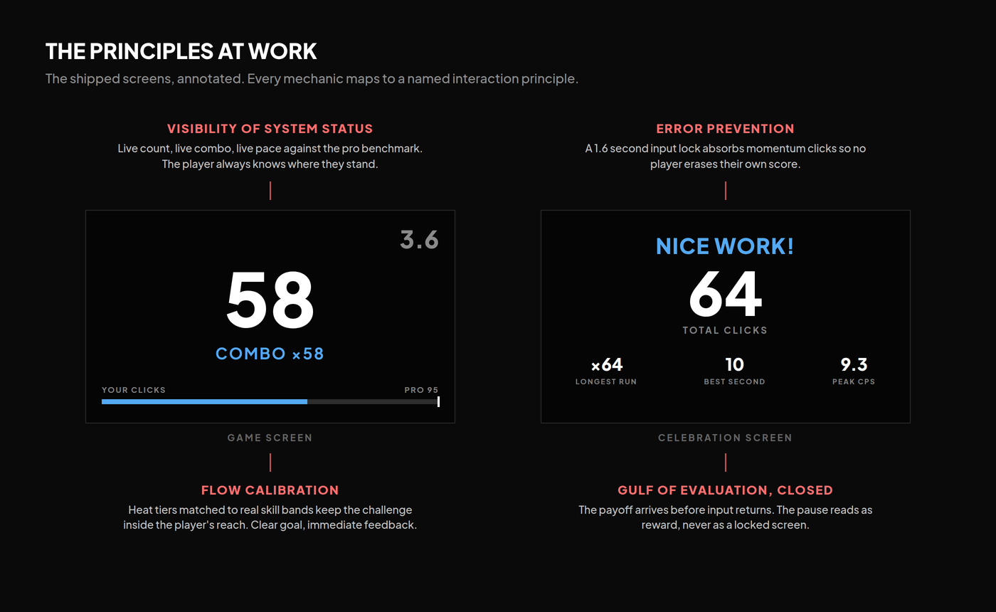
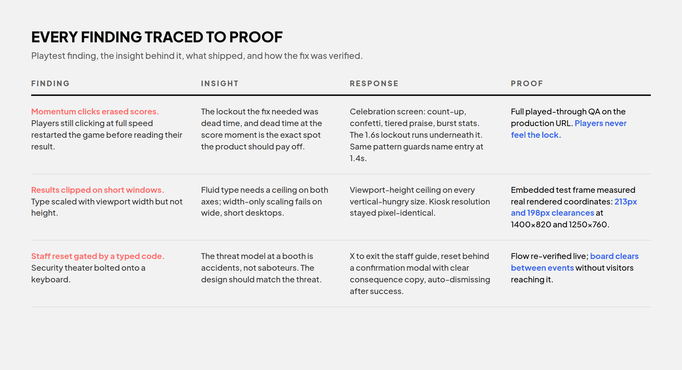
Back to the playtest bug. My first fix was mechanical: a 1.6 second input lockout on the results screen, and a deliberate PLAY AGAIN button replacing click-anywhere. It stopped the accidental restarts.
It was also the wrong fix, and I shipped it anyway. A locked screen is dead time. The player stares at a frozen scoreboard, waiting out a timer they cannot see, at the exact moment the product should be paying them off.
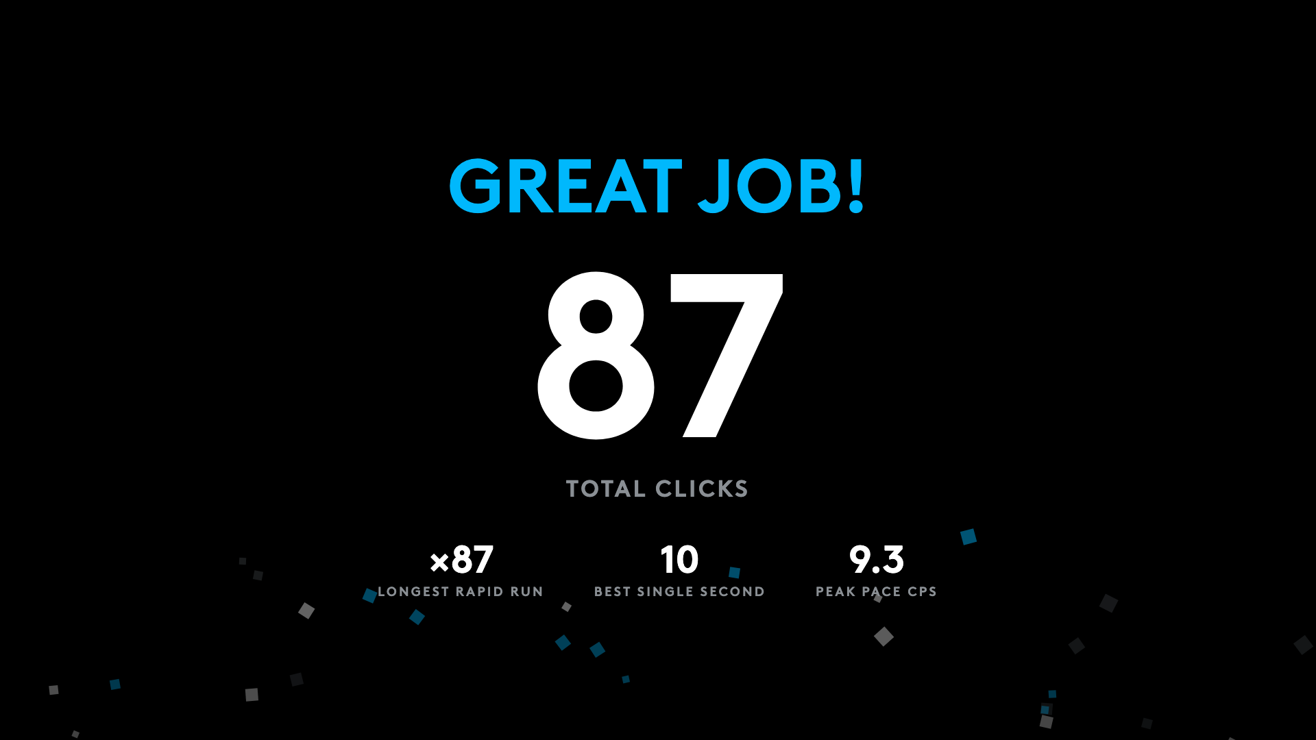
The second iteration reframed the dead time as the reward. A celebration screen: the score counts up, square confetti falls in brand colors, a tiered praise headline lands, burst statistics fill in. The 1.6 second lockout still exists. Players never feel it, because the pause is now the payoff.
The same pattern later protected the name entry screen with a 1.4 second lock. The bug got promoted. It went from defect to the most delightful moment in the product.
Engagement without the slot machine
Kamp Grizzly asked for more engagement and named what they did not want: a Las Vegas slot machine.
So every reward maps to genuine performance. Heat tiers driven by live click pace, STRIKING at 4.0 clicks per second, RAPID FIRE at 6.5, SUPERSTRIKE at 8.5. Combo chains for clicks under 300 milliseconds apart. Milestone flashes. Rank titles at the finish. No randomness, no artificial near-misses, no manipulation mechanics. The dopamine comes from skill feedback, not chance.
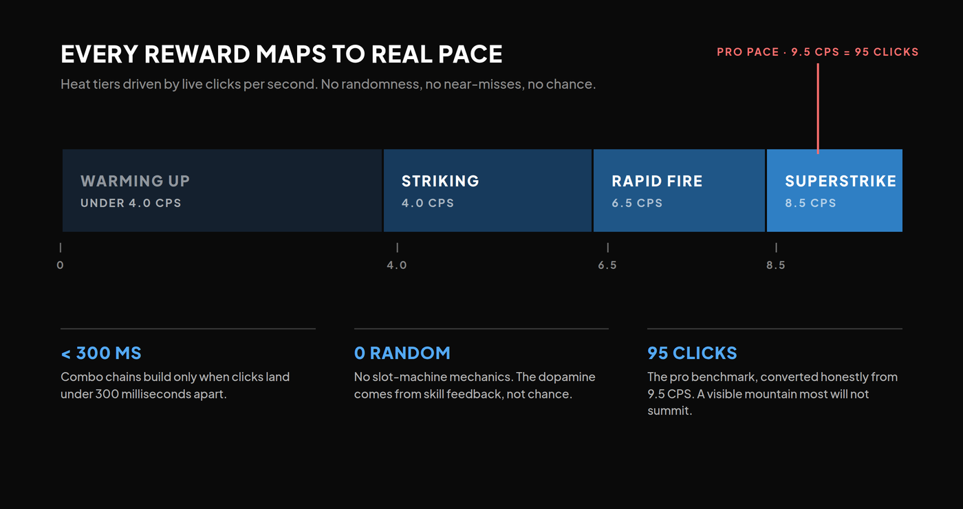
Scoring changed for the same audience. The original model scored clicks per second. It shipped as total clicks, because whole numbers read instantly to a casual visitor. 66 clicks means something at a glance. 6.6 CPS requires math. The pro benchmark converted honestly: 9.5 CPS became 95 clicks.
95 gives every player a visible mountain. Most will not summit it, and that is the point. The gap is the story visitors tell each other at the booth.
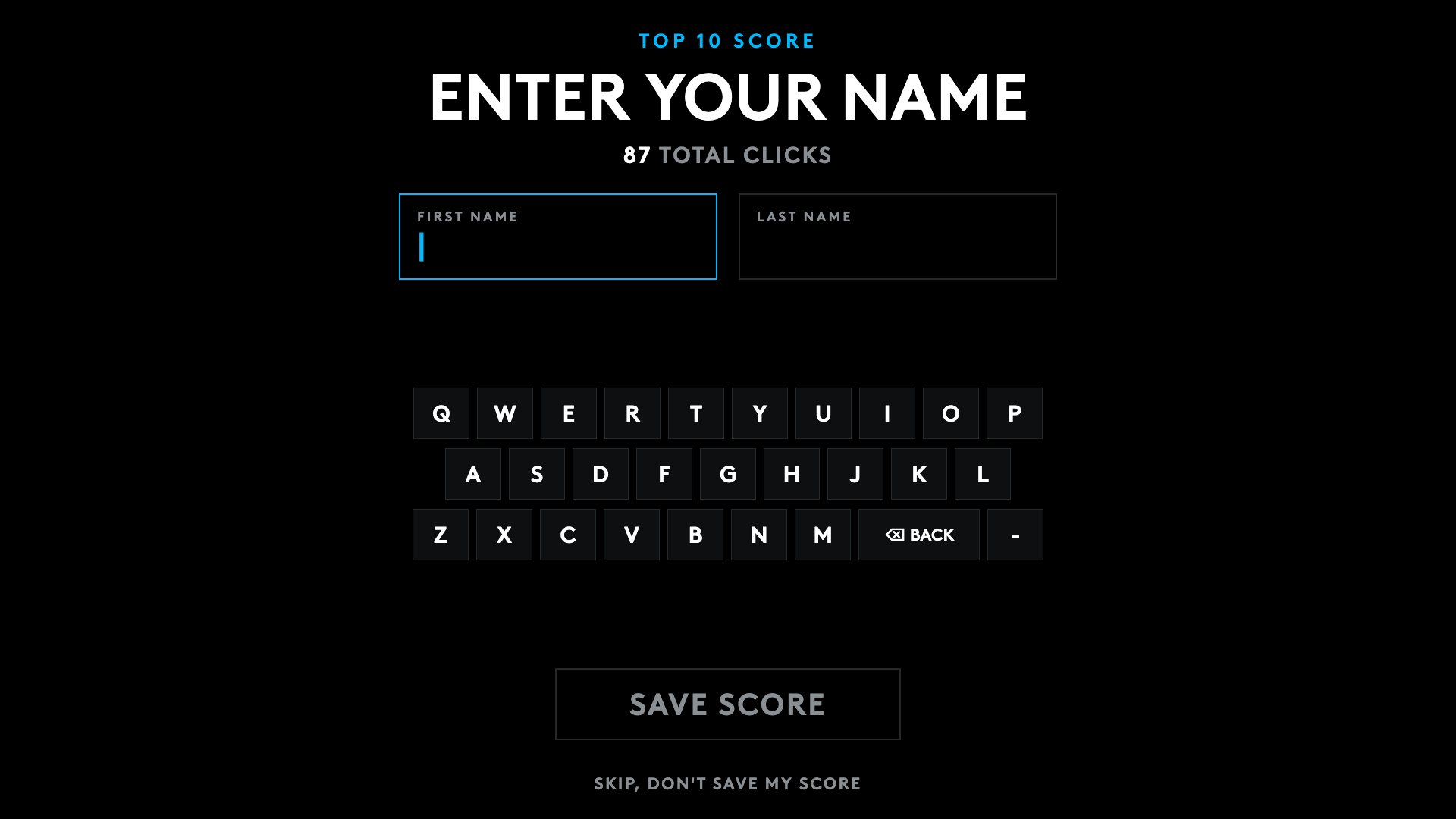
The top 10 board fed a prize giveaway, which forced integrity decisions. The fake seeded scores came out, so the board starts empty and honest. A skipped name entry saves nothing, because an anonymous row can never hold a prize slot. Names enter through an on-screen QWERTY or the physical keyboard, with Tab, Backspace, and Enter fully wired.
Storage was a scope decision I put to the client in plain language. In-memory at zero cost. Single-machine persistence at thirty minutes of work. A shared cloud backend at half a day plus infrastructure. The middle option matched the actual event, one display machine and a 24-hour prize window, so scores live in localStorage and survive refreshes and reboots without a backend. Right-sizing a build earns more trust than over-engineering one.
The second thread: art direction from an Illustrator file
Running under all of this was the art direction. Kamp Grizzly delivered brand comps as an Adobe Illustrator file: the official Logitech G wordmark, the SUPERSTRIKE CHALLENGE naming, the Brown typeface, four screen layouts. My job was to apply it faithfully, not to interpret it.
Two moments tested the discipline. The comps still showed the PRO X2 and CPS scoring while the written instructions specified PRO X3 and total clicks. Written client direction overrides stale visuals, so the build followed the instructions, and the conflict went into the log for sign-off instead of getting silently resolved.
The X3 pivot then created its own problem: a black mouse on a black canvas. The fix was a radial charcoal backlight behind the render, separating the silhouette while honoring the no-drop-shadows rule.
And for one working day, the typography ran on Montserrat as a declared stand-in, because the licensed Brown font files had not arrived. It was named in the style guide and never passed off as final. When the files landed, they swapped in through two font-face rules with zero layout churn.
What broke
Mid-engagement, a genuine disagreement: was the live site running the responsive build? I believed it was. The evidence said no. Reading the live page’s internals in the browser showed the old scale transform and a missing viewport meta. The build on the URL was not the build we were discussing.
Looks responsive and is responsive are different claims. The original build scaled a fixed 1920x1080 stage to fit any window, which looks flawless on a desktop and renders a miniature kiosk with 8px labels on a phone. The replacement was true reflow: fluid type, stacked layouts under 940px, single-column results under 1100px, touch input, and copy swapping CLICK for TAP on touch screens.
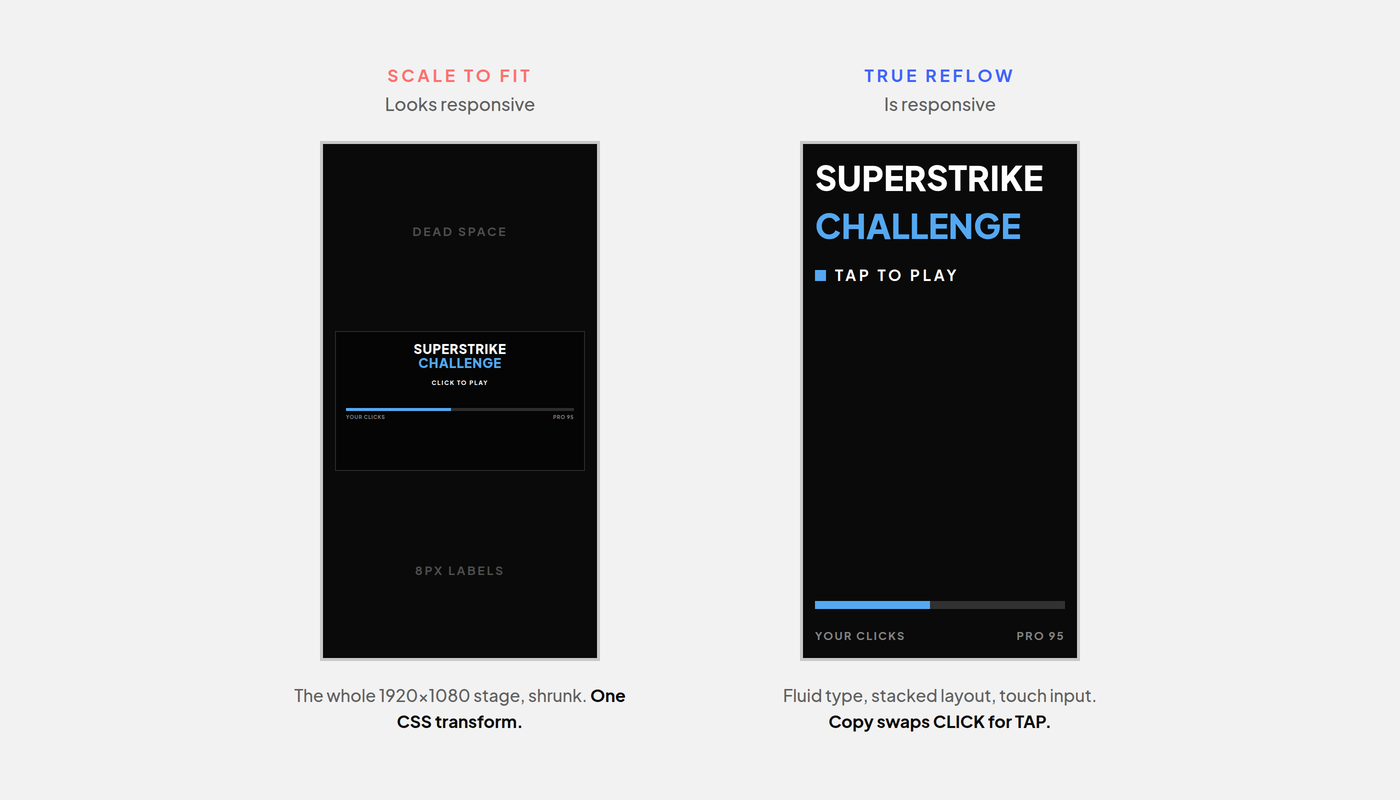
A second lesson arrived late. Type scaled with viewport width but not height, which clipped the results screen on short desktop windows. Every vertical-hungry size got a viewport-height ceiling, verified numerically with an embedded 1400x820 test frame measuring real rendered coordinates. The kiosk resolution stayed pixel-identical.
Two smaller breaks are worth naming, because you are the audience most likely to check. Deploys shipped zero files twice, because the deploy folder held a stale file. The Netlify output line reading “CDN requesting 0 files” became the tell, and the process hardened around checking it. And local version folders drifted to v03 while the client-facing release stayed V02. Harmless, caught, documented, and the standing argument for the git migration planned next.
Two things shipped unresolved. Mobile sound is parked as a known issue; desktop is the paying use case and works, mobile browsers gate audio playback differently, and the fix was deferred on purpose instead of rushed. And localStorage is the wrong answer for a multi-kiosk event. The upgrade path is scoped. Whether this kiosk ever runs on two machines at once is the question the project left open.
Where the AI sat, and where it did not
You are probably wondering how one designer shipped this in five working days with no developer. The honest answer is a toolchain, with judgment sitting on top of it.
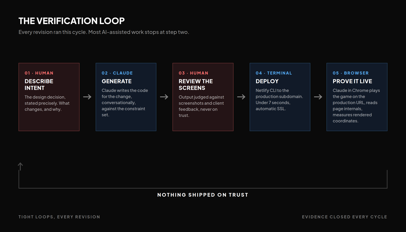
Claude Design authored the original kiosk concept and its handoff brief, which seeded the engagement with structured constraints. Claude was the design and build partner, and Claude wrote the code: every screen, mechanic, and revision iterated conversationally against screenshots and client feedback. Claude in Chrome was the evidence engine, verifying the live site after every deploy, running full played-through QA, and reading page internals to settle the responsive dispute. Deploys ran through the Netlify CLI, under seven seconds to a displayedux.com subdomain with automatic SSL.
The judgment stayed human. I rejected the product-forward direction and named why. I set the gamification ethics line. I caught the results-screen collision and the wide-screen clipping in my own screenshots. I chose the storage scope against the client’s actual event.
The clearest example is the admin flow. Staff needed to clear the board between events without visitors doing it. The first implementation gated the reset behind a typed numeric staff code. I rejected it as security theater bolted onto a keyboard, and specified the replacement: an X to exit the staff guide, a reset button opening a confirmation modal with clear consequence copy, auto-dismissing after success. The threat model at a booth is accidents, not saboteurs, and the design should match the threat.
Most AI-assisted work stops at generation. This practice extends through instrumented proof on the production URL. Nothing shipped on trust. The browser evidence closed every loop.
The playbook
- Read hard constraints as the design system, delivered early. The two-metre rule wrote the type scale. Radius zero and no shadows wrote the depth model.
- Spend booth attention on play, not product. One question converts a visitor into a player. The brand rides the experience.
- When a fix creates dead time, make the dead time the payoff. The 1.6 second lockout became the celebration screen.
- Reward skill, never chance. No fake near-misses, no seeded scores, no anonymous prize rows.
- Written client direction overrides stale comps. Follow it, log the conflict, get sign-off.
- Scope storage to the actual event, and show the client the tradeoff before the recommendation.
- Prove it on the production URL. Trust nothing, including instinct.