The college application process overwhelmed students applying to multiple schools. Each required a separate application, separate essays, and separate submission processes. At Appily.com (formerly Cappex), I designed the Universal College Application: one essay, one profile, submitted to 200+ partner colleges simultaneously. The platform scaled from 250,000 to 1.5 million users during my four years, and now serves 4 million+ as Appily.
Students were not failing to complete applications. They were choosing not to start them.
"I am applying to 8 colleges. I have written 12 different essays. I am exhausted."
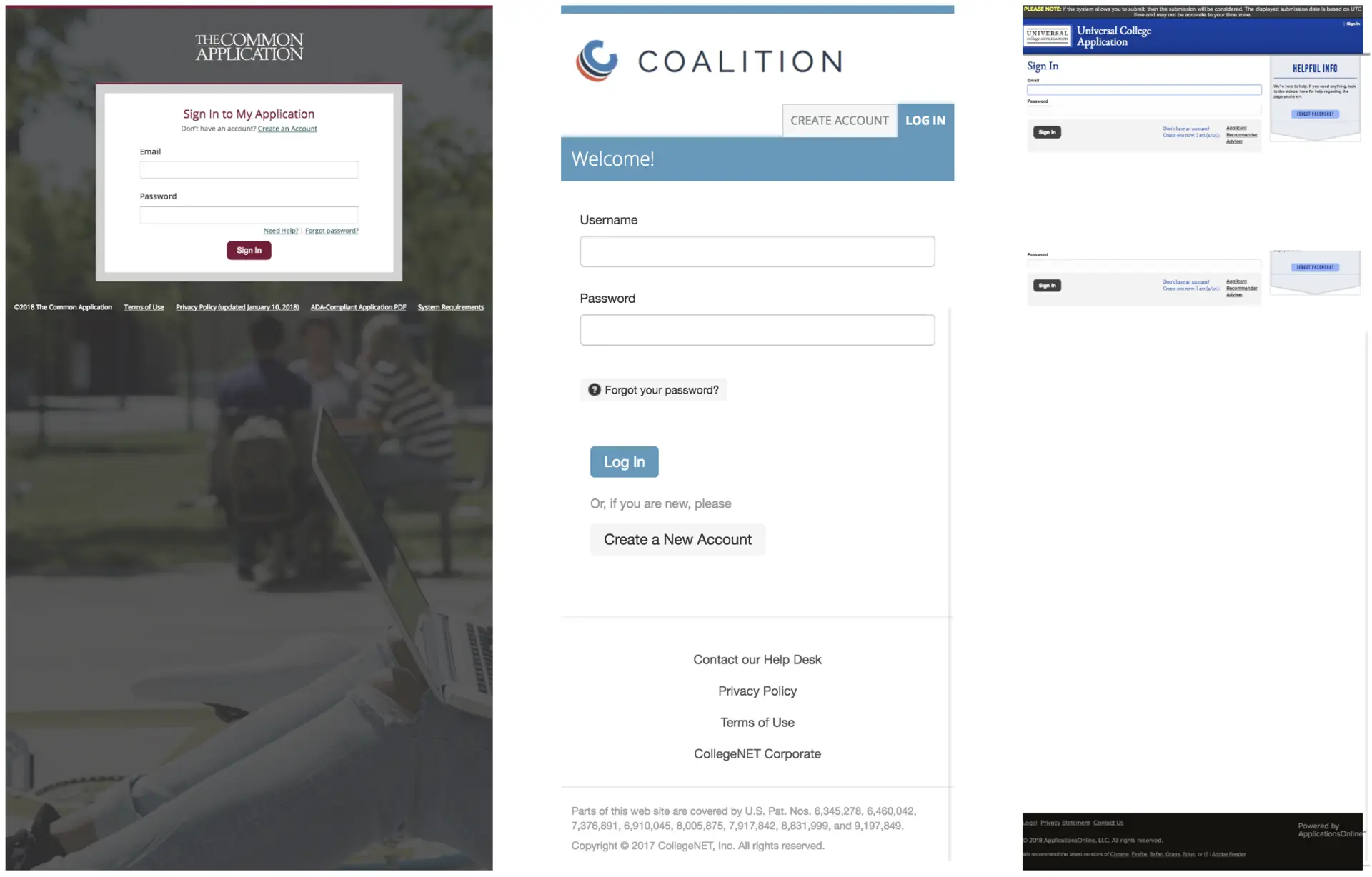
I ran surveys, interviews, and focus groups with high school students and observed them attempting to complete multiple college applications. The behavior was consistent: students opened dozens of browser tabs, copied and pasted content between applications, made mistakes, and gave up.
Industry data confirmed the pattern. The average college application completion rate was 20–35%. Students started applications and abandoned them before submission at rates that admissions officers described as deeply frustrating.
The first-generation student problem was sharper. First-generation students graduated at a 24% rate compared to 59% for continuing-generation students. The application process was a primary barrier. The system assumed a familiarity and a financial cushion they had not been given.
I also met directly with admissions offices at partner universities. What they told me reframed everything. They wanted more applicants. They were losing qualified students not to competing schools but to the friction of applying. Universities and students were failing each other because the system connecting them was broken.
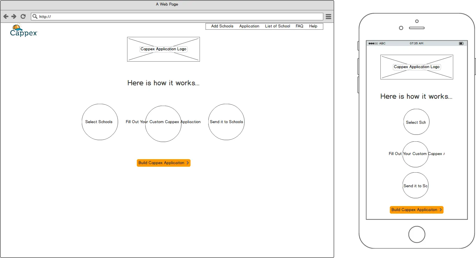
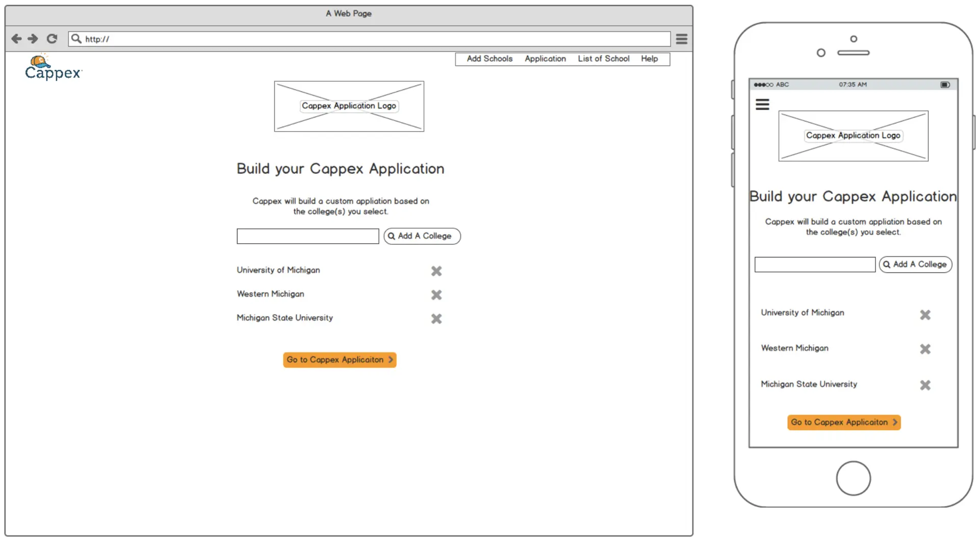
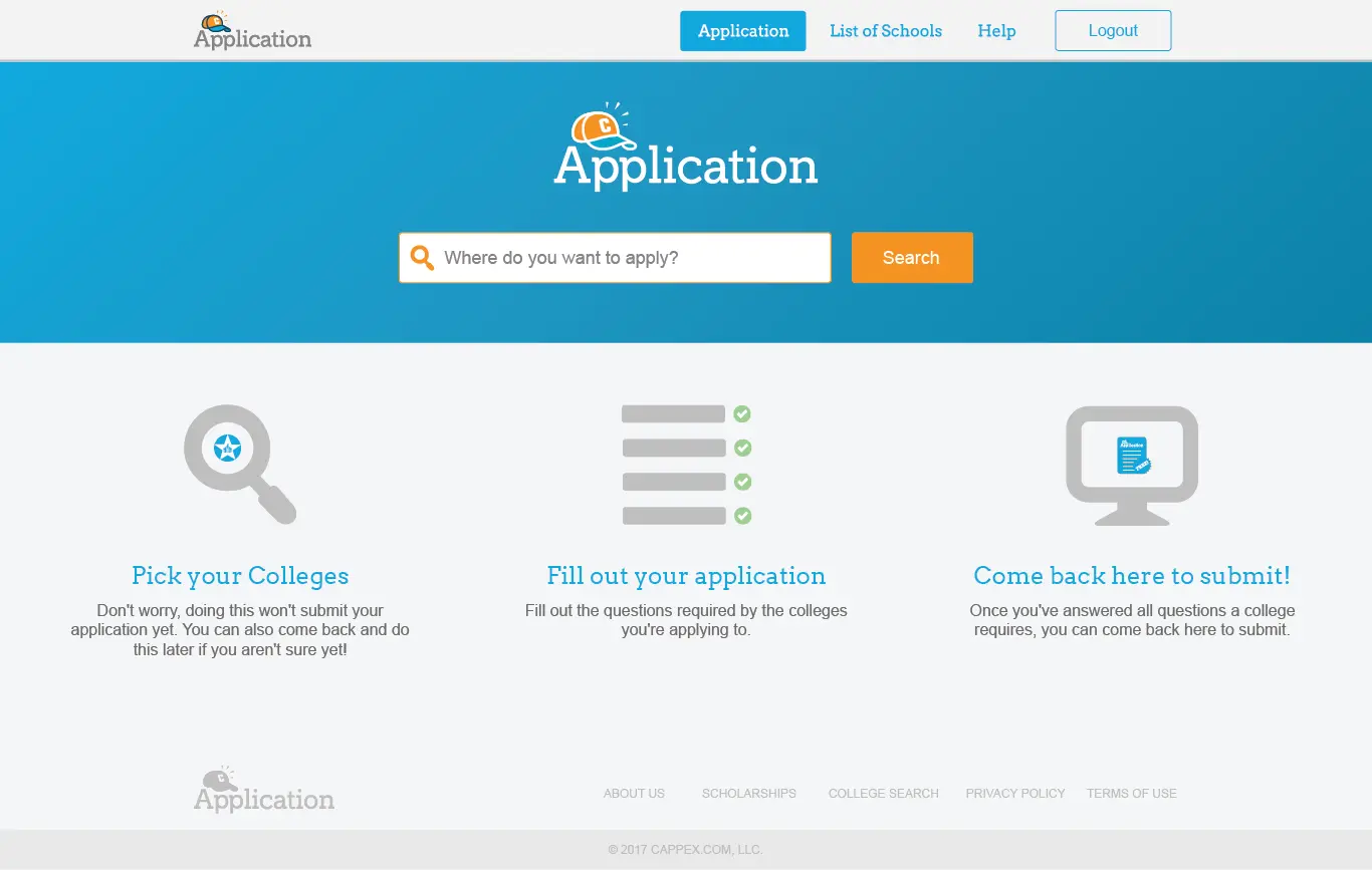
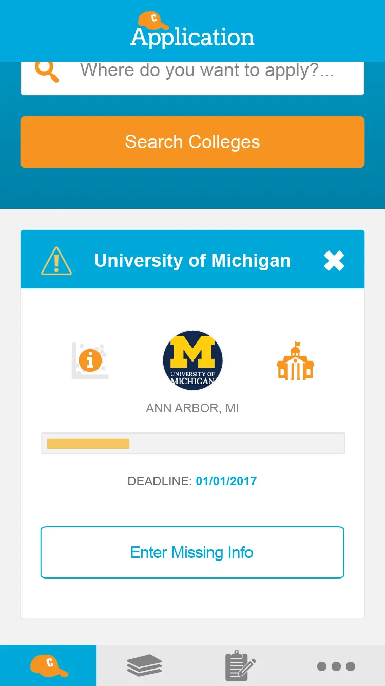
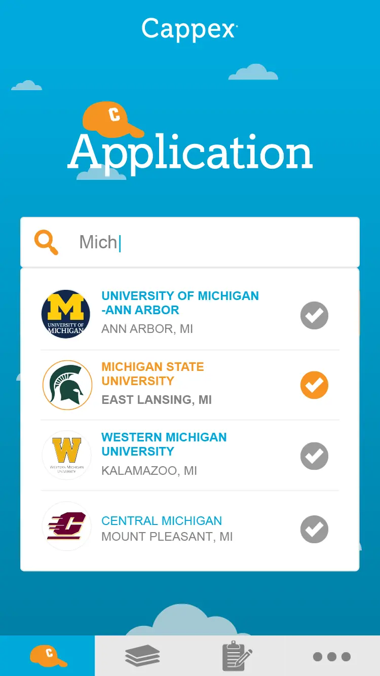
Early onboarding wireframe: the flow from empty dashboard to first school added. The core design challenge was making the first step feel achievable, not overwhelming.
Remove friction at every step. Do not add features. Remove obstacles.
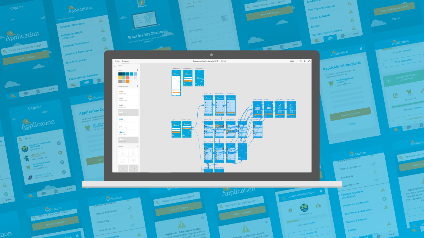
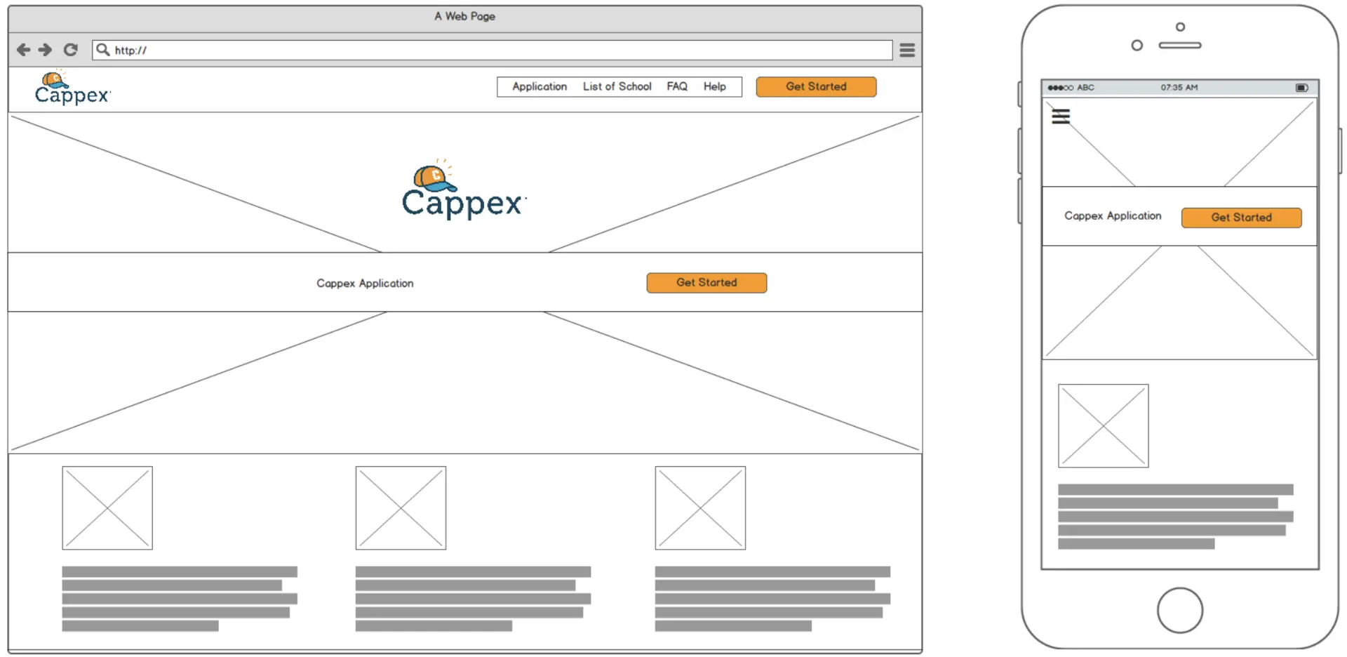
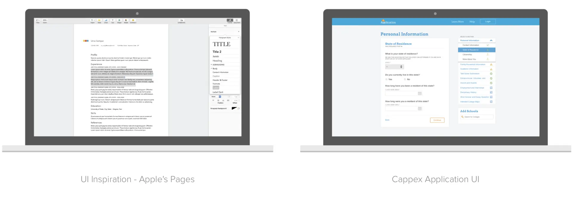
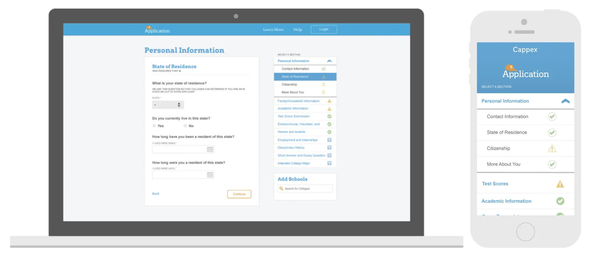
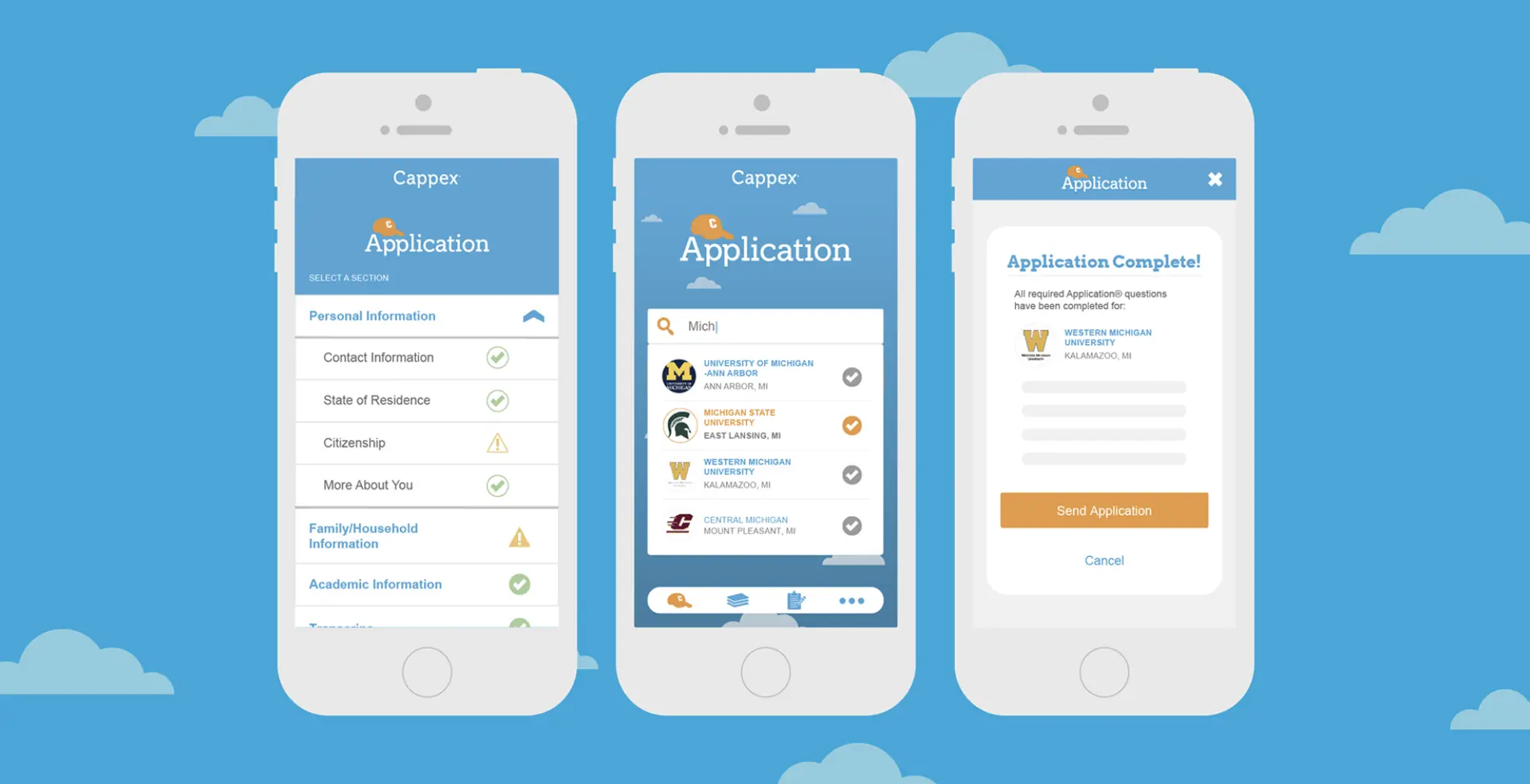
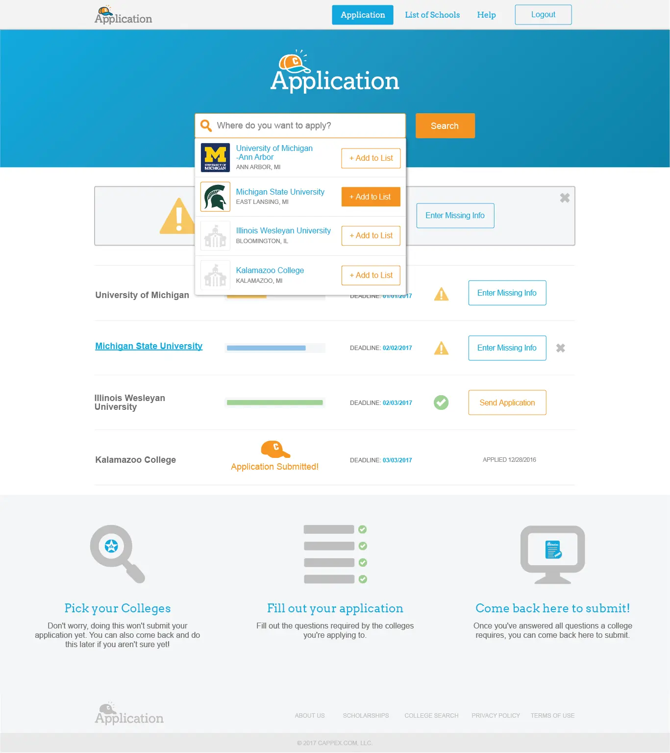
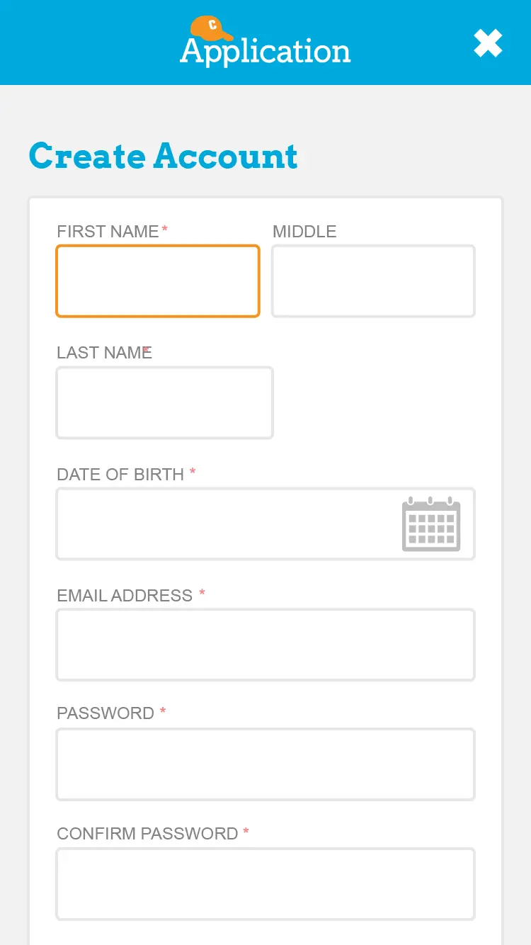
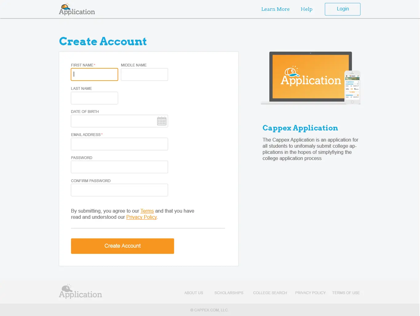
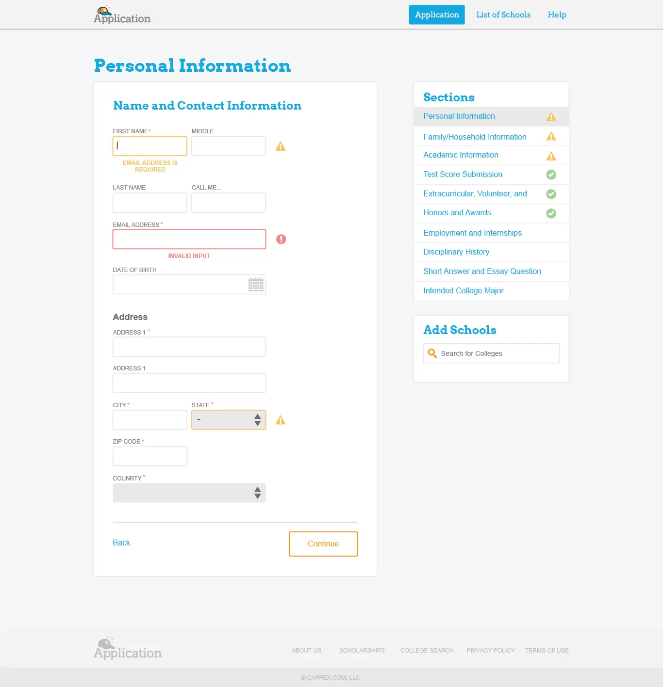
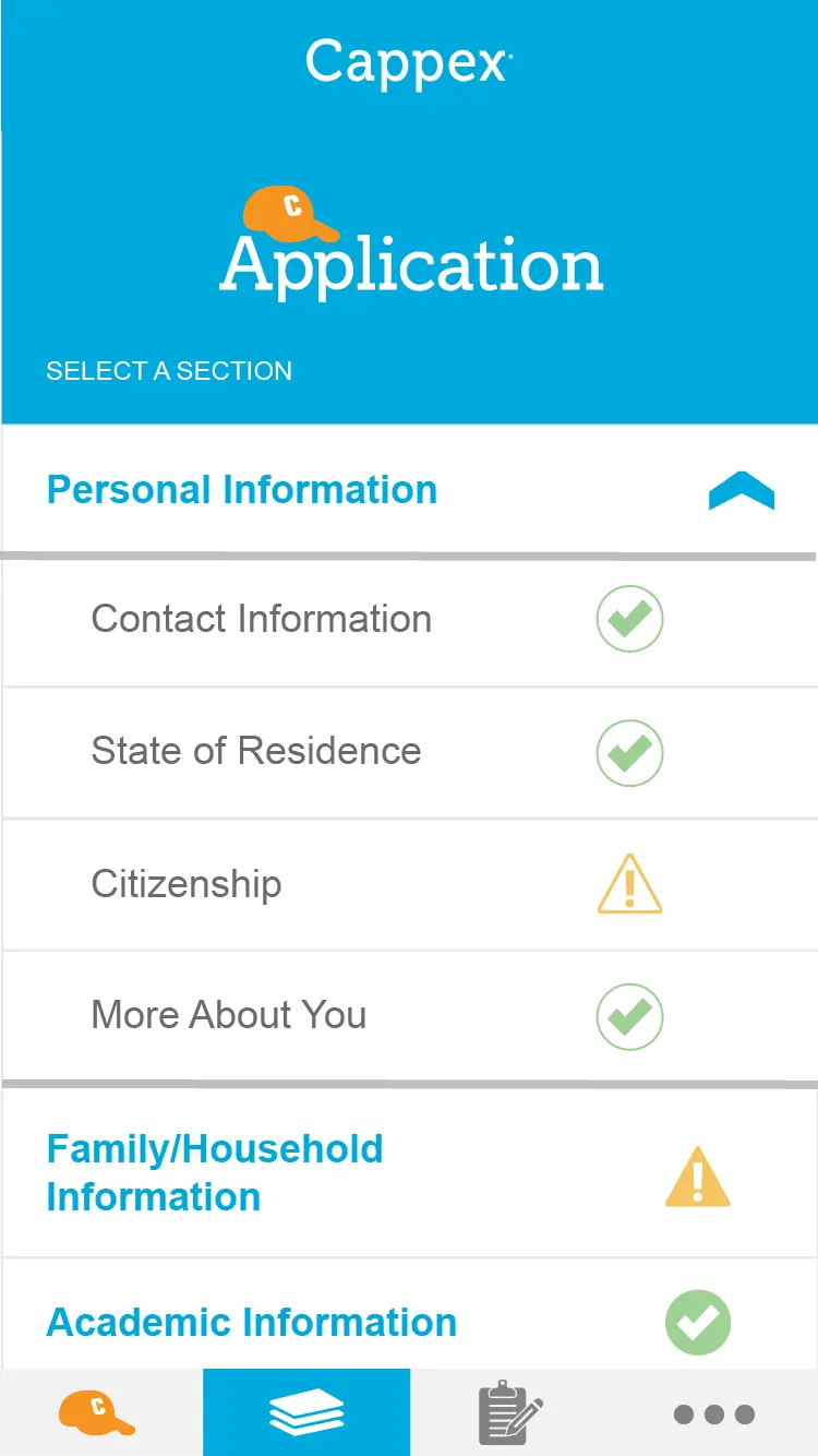
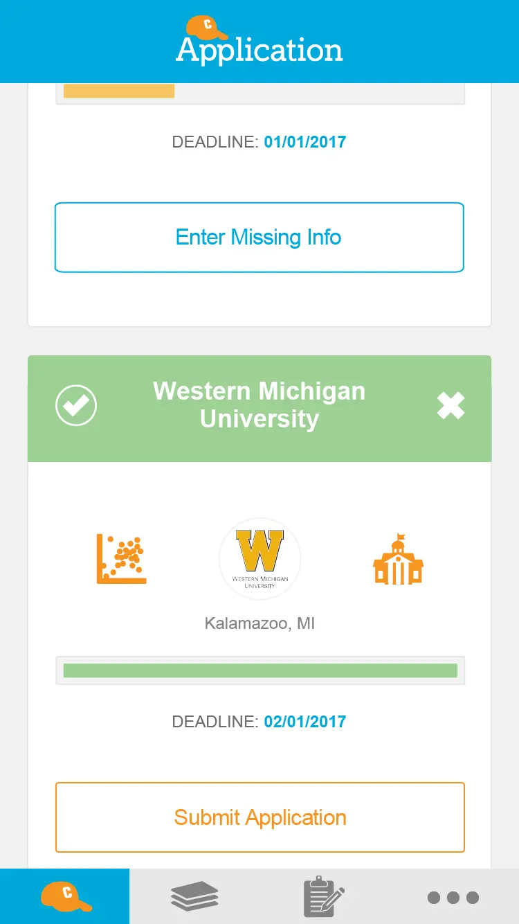
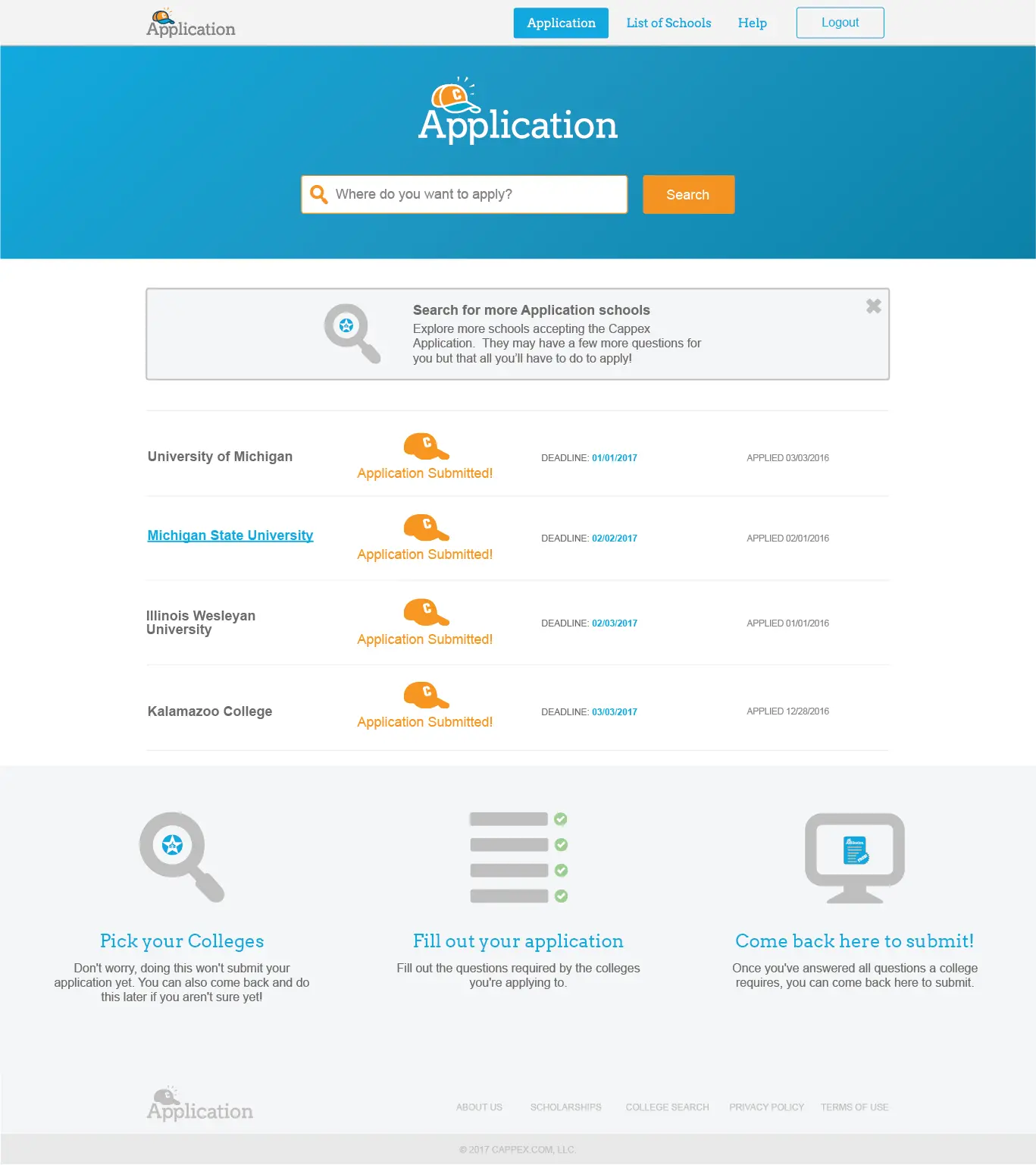
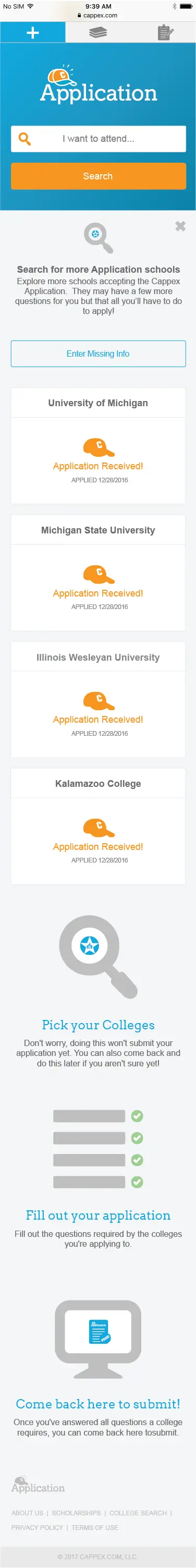
The core design decision: a single universal profile. Name, address, high school, test scores, entered once, auto-filling across all applications. A single universal essay prompt accepted by all 200+ partner colleges.
I mapped every step of the traditional application process and asked one question at each: does this step require unique information, or is it repeated from another form? Most steps were repetitions. I eliminated or pre-filled them.
For a significant portion of partner universities at launch, the application was free. Removing the per-application fee directly addressed the financial barrier that stopped first-generation students from applying broadly in the first place.
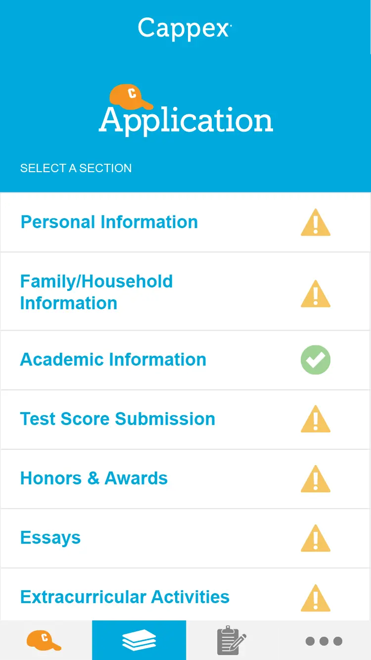
The dashboard design went through three major iterations. The empty state needed to feel inviting, not overwhelming. The populated state needed to surface exactly what was still needed without making the completed work feel precarious.
Continuous testing with real high school students. Not assumptions about them.
I tested throughout the design process with students at local high schools. Early testing revealed confusion about the college selection interface. Students did not understand how to add schools to their list. I redesigned the flow with clearer calls-to-action and visual confirmation feedback.
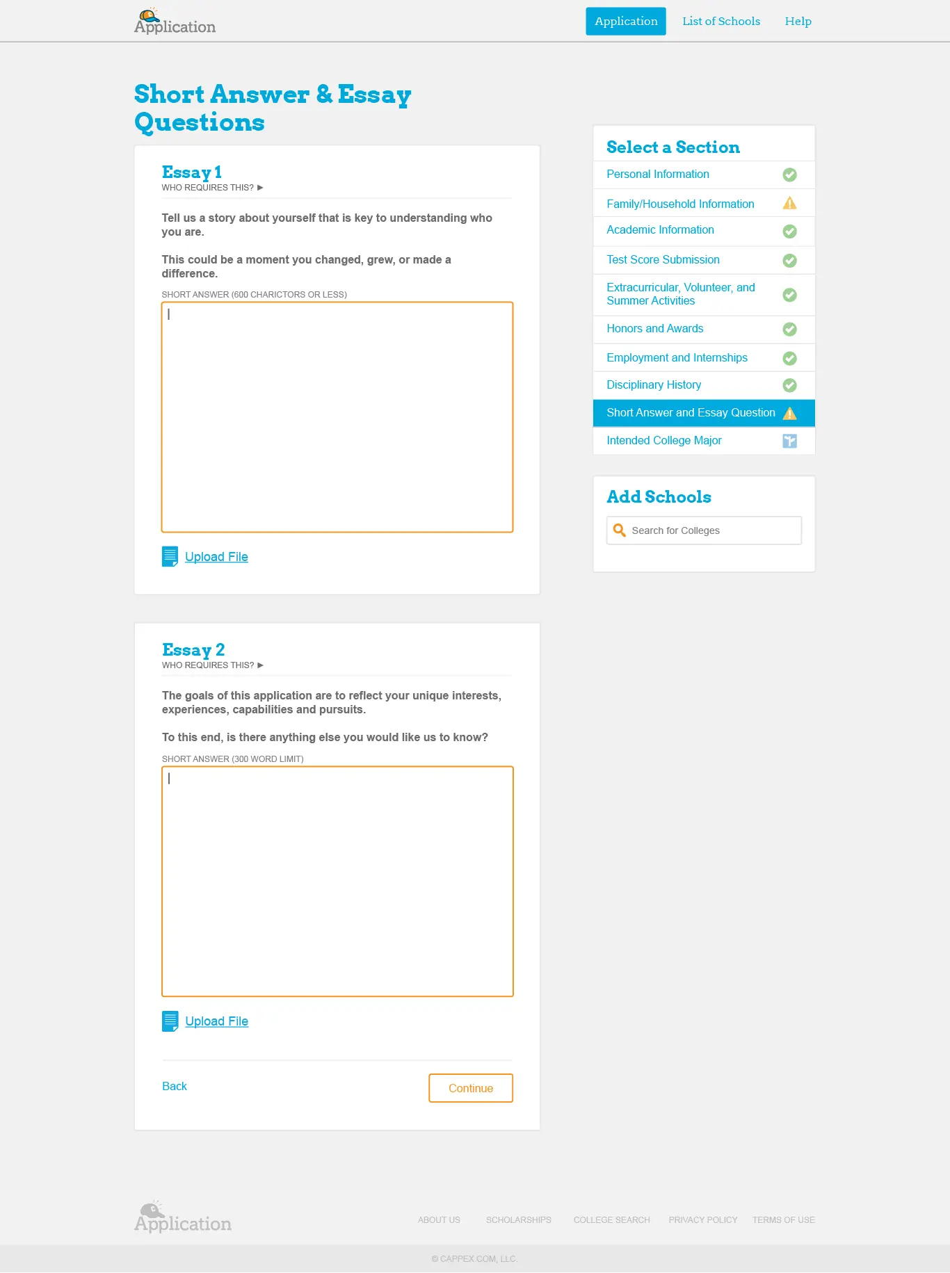
The essay section required the most iteration. Students needed to understand that one essay would go to every college they selected. The first version buried this context. The final version made it the first thing students saw when they reached that section — framed as the feature it was, not a constraint.
The single most impactful change after launch: making the essay word count visible in real time with a confidence indicator rather than a hard limit. Students who hit a hard word limit stopped. Students who saw a confidence indicator kept writing and then edited.
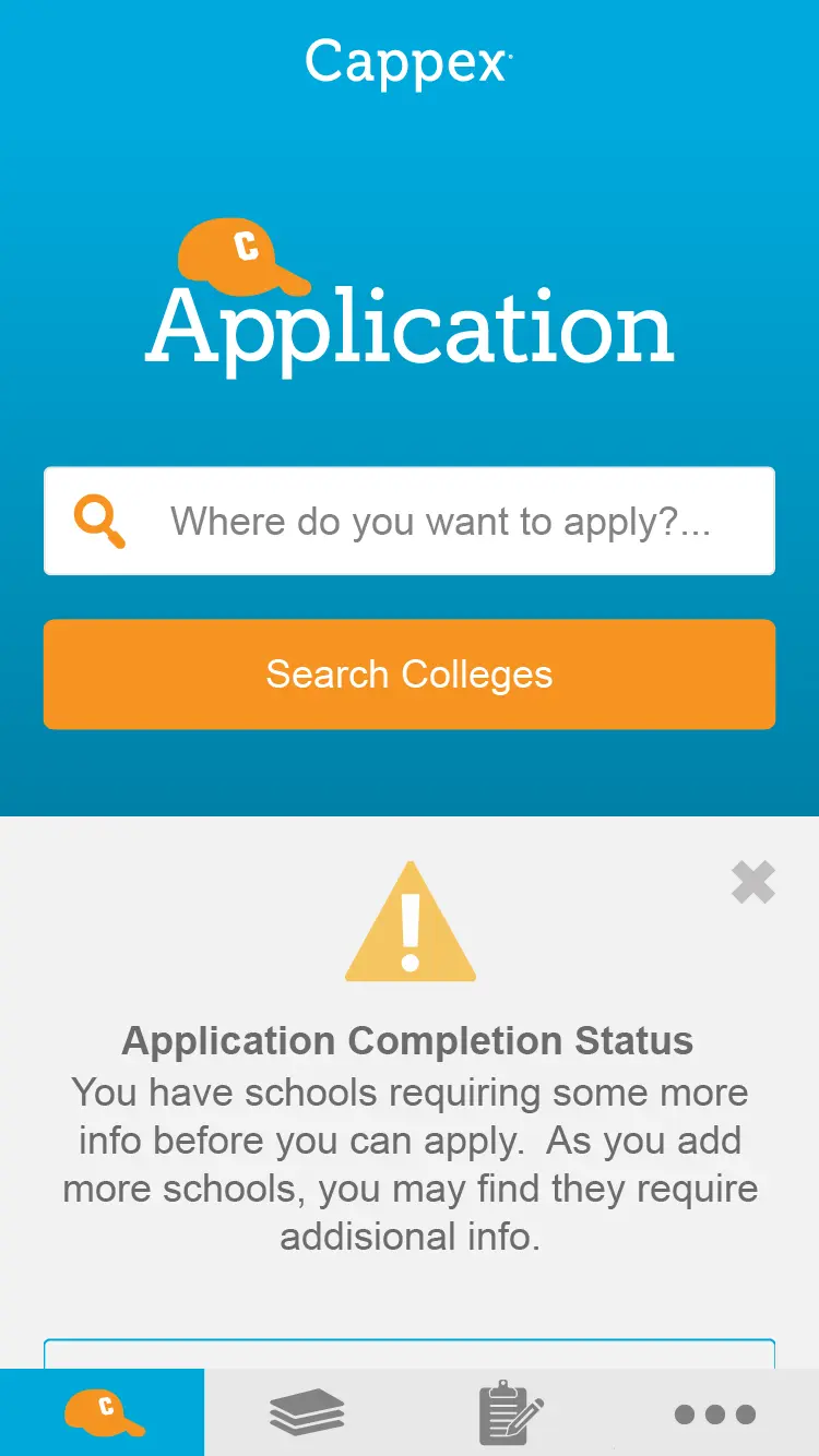
Error states were a key focus. When students made mistakes, the interface needed to explain exactly what went wrong and how to fix it, without making them feel they had lost their work.
47% completion. 600% user growth. The standard completion rate was 35%.
The Universal College Application achieved a 47% completion rate against a 20–35% industry standard. Students applying to 10 colleges spent 6 hours on the Appily.com platform compared to 30+ hours on traditional applications.
The platform scaled from 250,000 users in 2015 to 1,500,000 users by the end of my tenure. It now serves 4,000,000+ users as Appily following EAB's 2020 acquisition. Partner colleges grew to 200+ institutions including the University of Michigan and Michigan State.
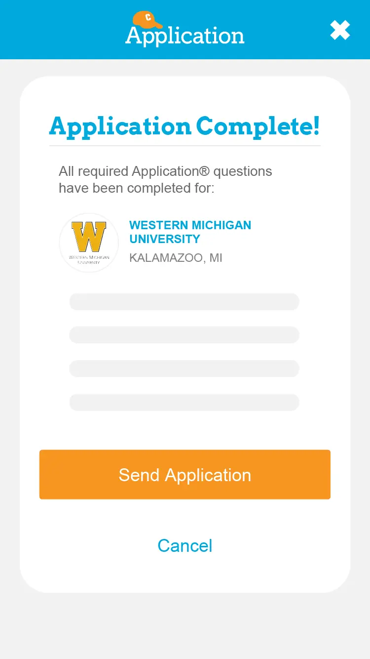
Session time increased 25%. Bounce rate decreased 10 percentage points. The application complete state — the moment a student submits to every college at once — was the culmination of every friction-reduction decision made across four years.
Simplicity is the hardest design problem. Adding is easy. Removing is not.
Every iteration cycle produced the same finding: students wanted less complexity, not more features. The temptation was always to add guidance, add tooltips, add helper text. Every addition increased the cognitive load on students who were already overwhelmed.
The metric I am most proud of is not the completion rate. It is the students who applied to schools they would not have applied to otherwise because the process was no longer exhausting enough to stop them.
If I were doing this today, I would push harder on measuring first-generation completion rates from day one. We optimized for overall completion. We should have measured, from launch, whether first-generation students were completing at the same rate as their peers. That data would have changed some of our prioritization decisions.
Institutional buy-in is a design problem. Getting 200 universities to accept a universal essay prompt required understanding their constraints as deeply as I understood students'. The best product decisions in that project came from those admissions office conversations, not the wireframes.
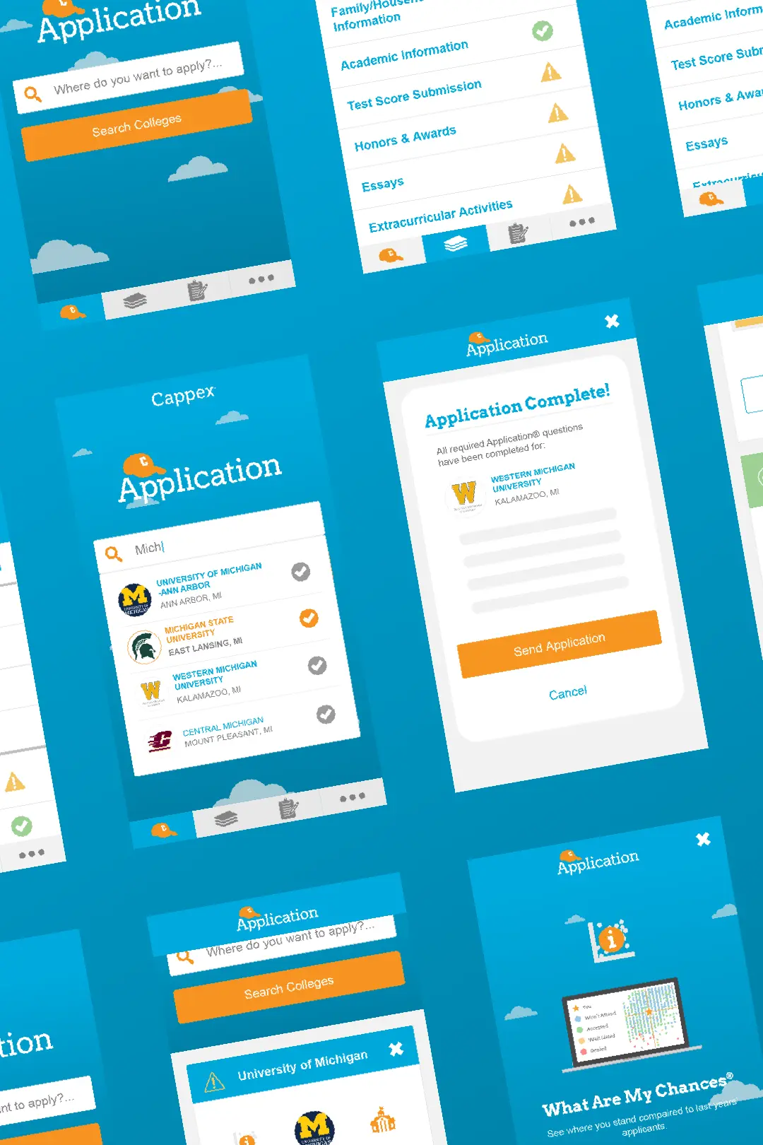
Full product overview: all application screens in context — from search through submission. Screens shown display the original Appily.com interface (formerly Cappex).