TeleSign's enterprise onboarding took 67 days on average. Every new customer required manual CS intervention — products provisioned by hand, API keys requiring CS involvement, government approval documentation handled email by email across 120-plus countries. I was brought in as Principal Product Designer to redesign this from the ground up, during a global pandemic, with a distributed international team and a constrained development budget.
The problem was not the interface. Customers should never have needed to contact TeleSign to complete onboarding at all.
"I never knew what step came next. I'd wait days for a response."
I spent one week shadowing the customer success team before writing a single brief. What I saw: a team spending 40 percent of their time answering the same questions, provisioning products by hand, and managing status updates through back-and-forth email chains. They were not doing high-value work. They were plugging gaps in a broken system.
I then interviewed twelve enterprise customers who had recently completed onboarding. Their frustration was consistent. They never knew what step came next. They waited days for responses. They had no visibility into their own progress.
The design question shifted. Not "How do we make the portal easier?" but "How do we design an onboarding experience that needs no handholding at all?"
What was built, what was not, and why the hardest problem was not the interface.
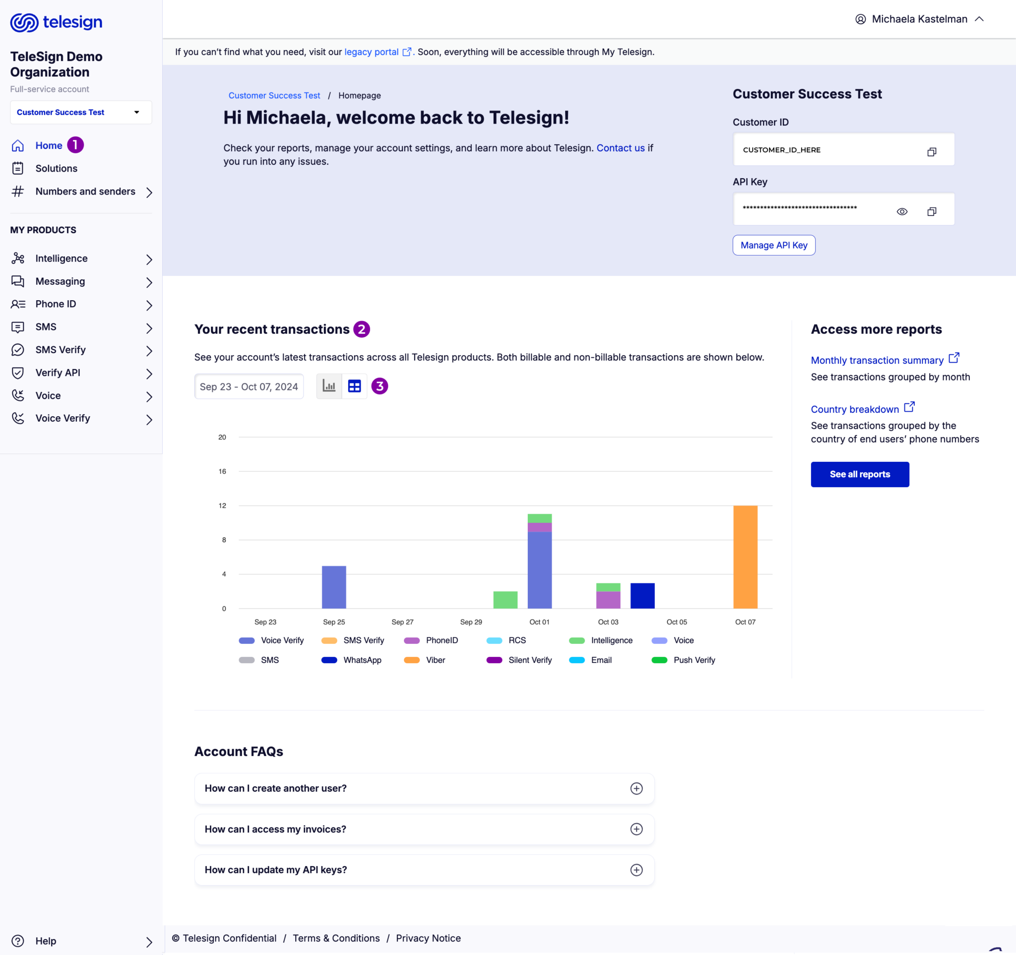
I designed a self-service portal giving enterprise customers direct control over every step: account creation, business verification, product purchasing, phone number acquisition across 120-plus countries, API key generation, and billing — all without CS involvement.
The first direction I prototyped was a guidance layer on top of TelePortal, the existing internal tool. Four customer tests killed it. TelePortal's information architecture was built for CS workflows, not customer workflows. Guidance on top of expert assumptions does not make a product accessible. The recommendation: build from scratch.
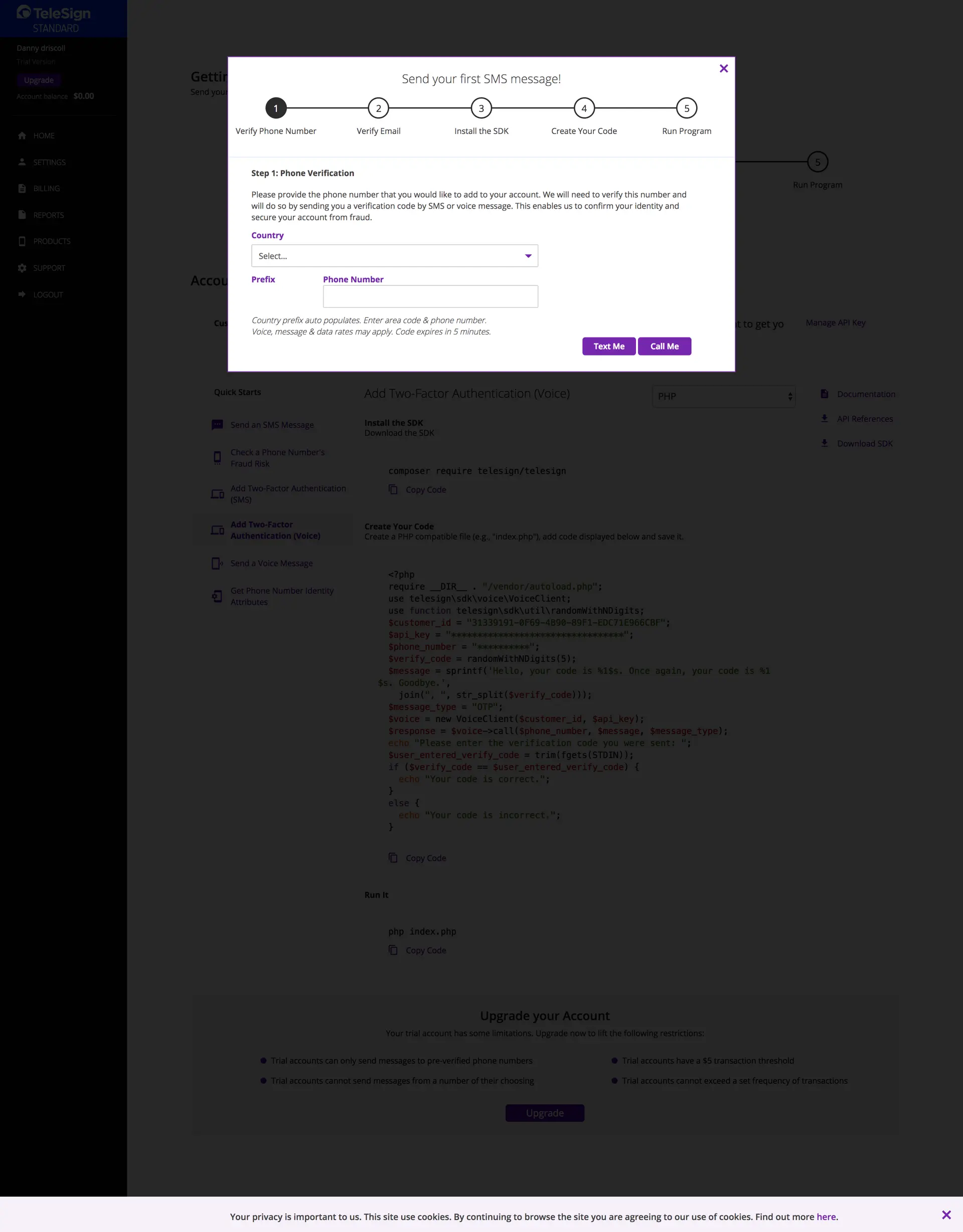
With a constrained story-point budget and a pandemic-distributed team across US and European time zones, every feature required a prioritization decision. The MVP covered the primary path only: account creation, product selection, phone number acquisition, and API key generation. Multi-language support, a regulatory documentation browser, and advanced usage analytics were deferred.
The hardest design problem was not the interface. It was the regulatory variation. Each of the 120-plus countries had different documentation requirements. The portal had to handle this complexity without exposing it. Dynamic flows surfaced only the requirements relevant to each customer's location and product, at the moment they were needed.

Three usability rounds. One pattern held across all of them: when users knew what came next, they completed the task.
Round 1 tested the internal CS team. Findings: the onboarding checklist was clear and motivating. Product descriptions needed simplification. API key permission labels were confusing.
Round 2 tested existing enterprise customers. The dashboard metrics were valuable, but users wanted historical usage data. Documentation links were not prominent enough. Billing needed a clearer invoice breakdown.
Round 3 tested new trial users with no prior TeleSign experience. Task: complete full onboarding and make a first API call in 30 minutes. Five of six completed it. Average time: 22 minutes.
Across all three rounds, one pattern held. When users knew exactly what came next, they completed the task. When the next step was ambiguous, they stopped and emailed support.


Two tiers of complexity. Both tell an important story.
First time in TeleSign history. Account creation, product purchase, API key generation, and first call — no CS involvement required.
Government approval timelines sit outside TeleSign's control. What changed: TeleSign's portion became self-directed, transparent, and fast.
85% of customers completed onboarding without CS intervention. CS workload on onboarding tasks fell 40 percent, freeing the team for retention work that required actual expertise. Daily transaction revenue grew from $500K to over $2M during this period.
The SMB market became economically viable for the first time. The CS overhead that made small accounts unprofitable was gone.
The phone number purchasing UI won TeleSign's 2019 Innovation of the Year award. The design system built for this project became the company standard — colors, navigation patterns, and typography adopted across all TeleSign products.

The redesigned portal homepage. Customer ID and API Key accessible on arrival. No CS required. What previously took 67 days for complex configurations now begins immediately.
Three things this project taught me.
Where design creates leverage. The onboarding flow itself was not complex to design. The complexity was in the regulatory rules for more than 120 countries. Getting those rules surfaced correctly, at the right moment, with the right context: that is where the design work had the most impact. The interface was the last 20 percent of the problem.
What I would do differently. I would invest more time in error state design from day one. When a customer hit a regulatory requirement they were not expecting, the experience dropped sharply. We fixed those cases iteratively. Designing for failure paths with the same rigor as the success path from the start would have shortened that cycle.
Constraint as design tool. A limited story-point budget forced every feature decision to be explicit. That discipline produced a better product than a fully-resourced effort would have, because it required the team to decide what success actually meant before writing a line of code.