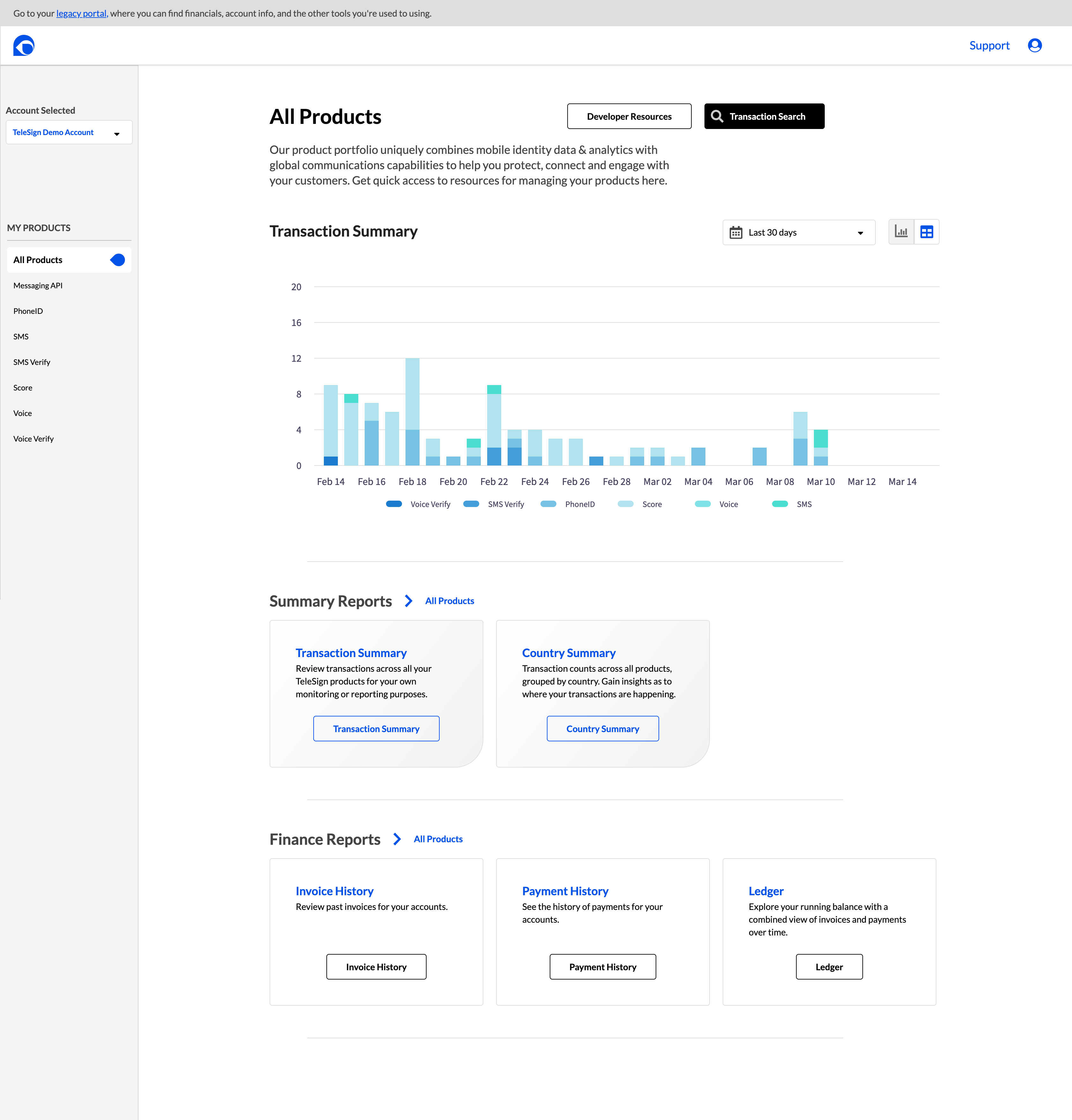
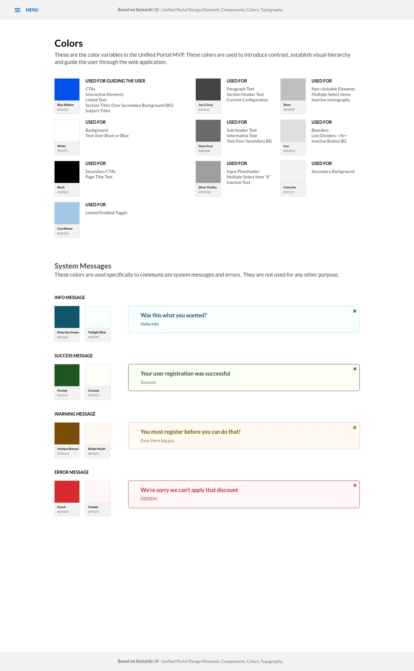
TeleSign's fraud prevention products protected Fortune 500 clients across financial services, e-commerce, gaming, and healthcare. I designed the UI for the full suite: PhoneID verification, Intelligence risk scoring, and SMS Country Blocking. The challenge was making a 1,000-parameter ML system legible to fraud analysts who needed to act in seconds, not minutes.
21 billion transactions annually. The analysts could not see why the system flagged anyone.
"I need to understand why the system flagged this user — not just that it did."
TeleSign's Intelligence product analyzed over 1,000 configurable data points to return real-time risk scores on a 0–1000 scale. The product was technically sophisticated. The problem was that the interface for configuring and acting on it was built for engineers, not for the fraud analysts who needed to use it under pressure, in real time, during active attack events.
I interviewed fraud analysts across financial services, gaming, and e-commerce clients. Their core frustration was consistent: the system would flag a user, but the analyst could not understand why. They were being asked to make consequential decisions — block a real customer or allow a potential fraudster — with insufficient information to act confidently.
The interface was not failing because the risk model was wrong. It was failing because analysts could not see into the reasoning behind the scores. The design problem was not accuracy. It was transparency.
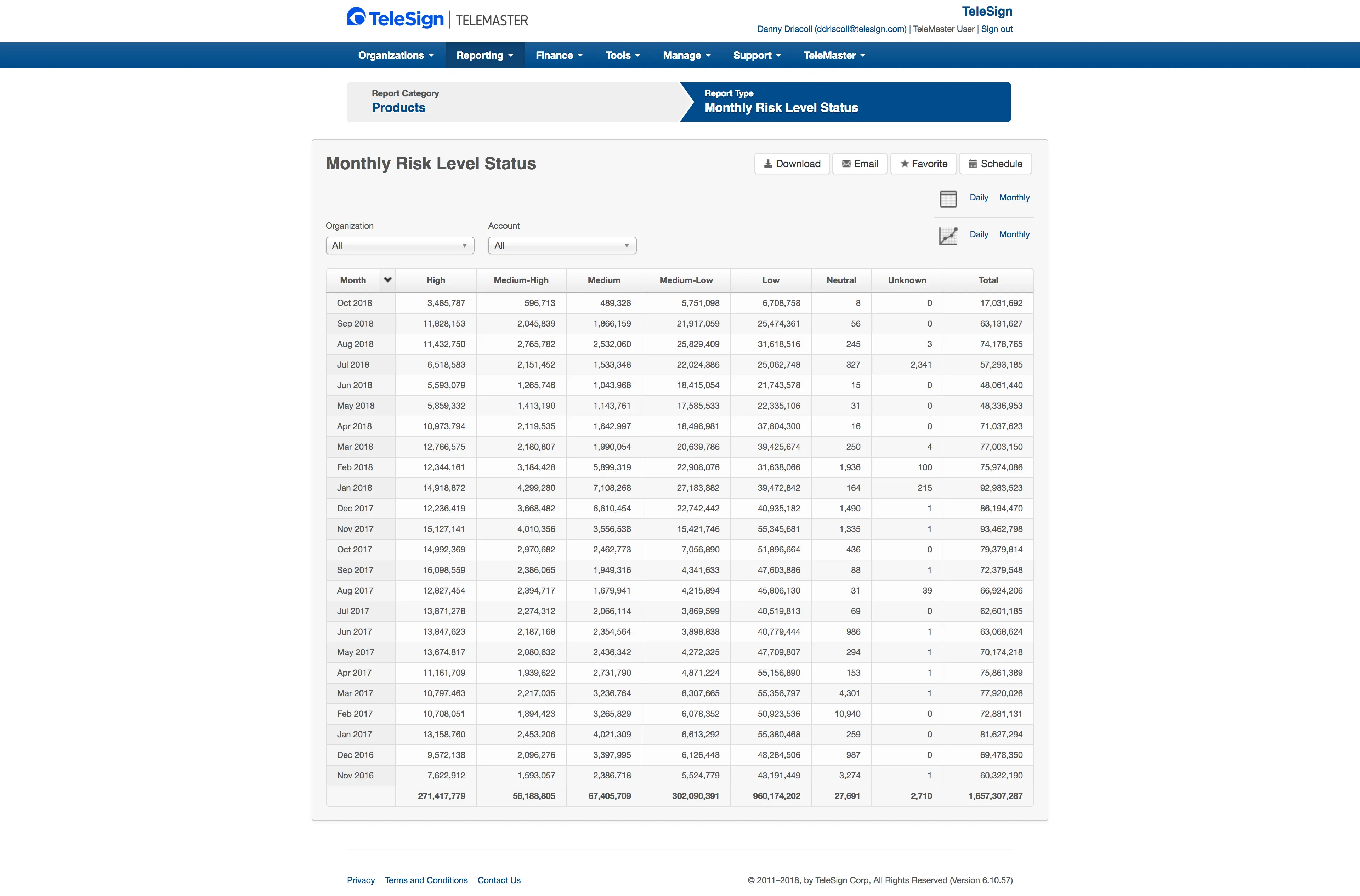
1.6 billion transactions. Seven undifferentiated columns. No recommendation, no signal hierarchy, no path to a decision. This is what analysts were working from.
Surface the reasoning. Make the machine’s logic visible.
I designed the fraud analyst dashboard to surface the specific signals driving each risk score — not just the score itself. SIM swap detection, breached data matches, porting history, location anomalies, carrier inconsistencies — all made visible and scannable at a glance.
The rejected direction: a simplified mode toggle. Testing showed that switching modes broke the analyst's workflow. The final design put both layers on a single screen — a clear allow/flag/block recommendation with the three highest-confidence signals visually dominant, and the full parameter set collapsed below for analysts who wanted to interrogate further.
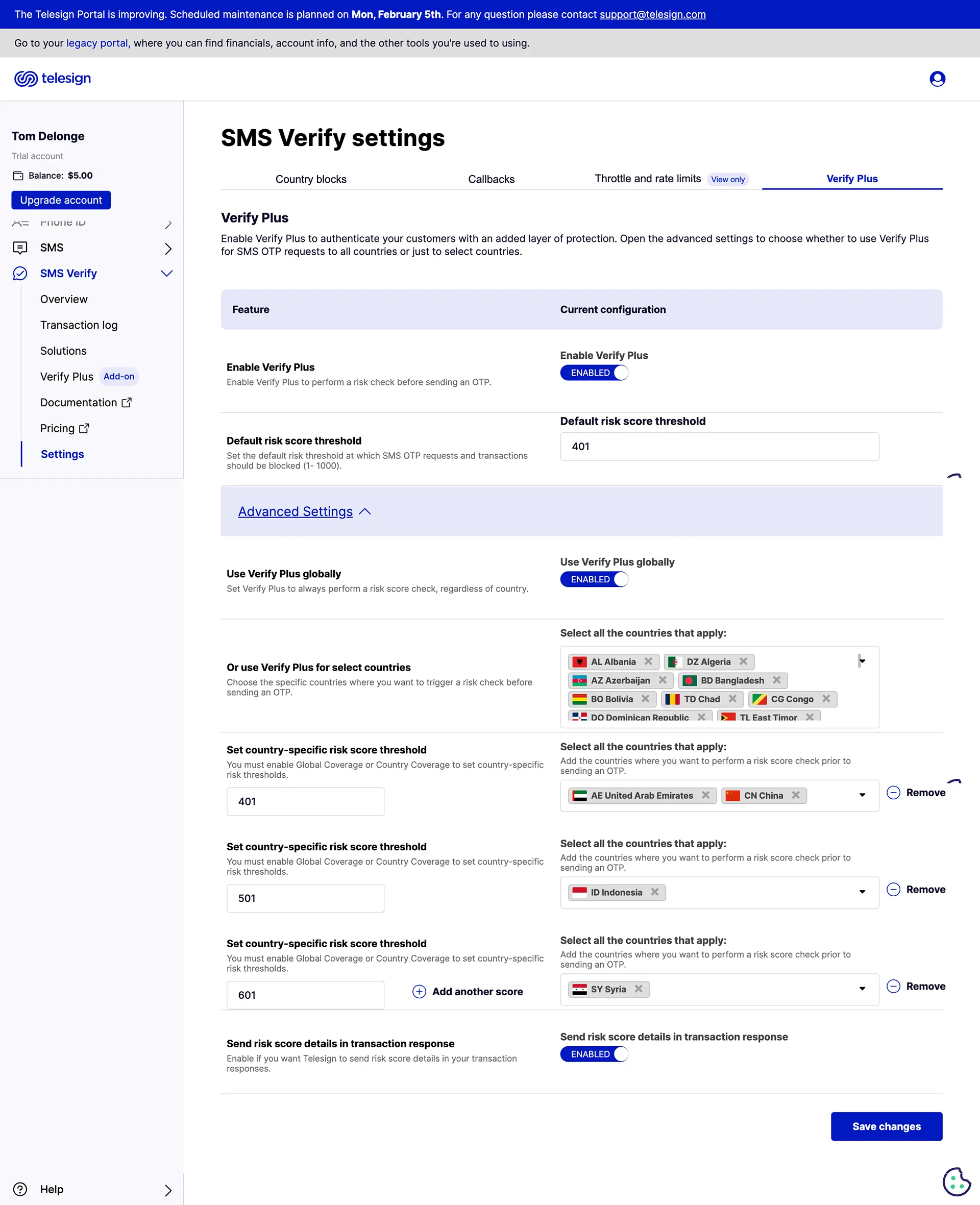
I also designed the configuration layer for non-technical analysts to adjust risk thresholds by attack type, by country, and by client context, without writing code or filing an engineering ticket. Every threshold decision was visible, reversible, and auditable.
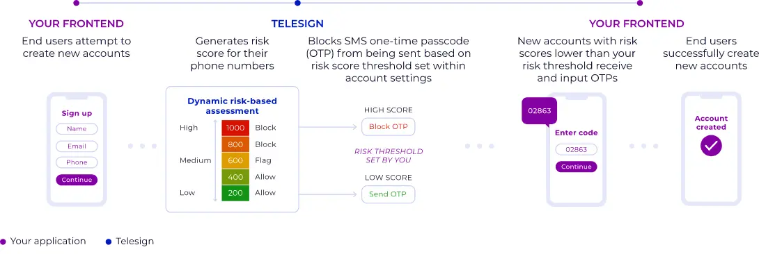
The recommendation architecture: every transaction scores 0–1000, every score routes to a decision, every decision is visible. The model’s logic becomes the interface.
Three rounds of analyst testing. One finding held every time: when analysts could see the signal, they acted faster.
Round 1 established that signal categories needed visual hierarchy. Analysts scanned by attack type, not by data source. The original flat table buried the most critical signals among hundreds of equal-weight rows.
Round 2 established that threshold changes needed an undo path. Analysts were reluctant to adjust settings they could not reverse quickly. I added change history and one-click rollback.
Round 3 established that risk scores needed to feel like risk. Early designs used a neutral palette. Analysts reported the interface felt flat — they had to work to feel the urgency of a high-risk score. The final design used saturated red for high-risk, amber for borderline, neutral for low. Two analysts flagged that color alone was unreliable across screens with different calibrations. I added a segmented bar as a secondary indicator, independent of color.
Across all rounds, one pattern held: when analysts could see exactly which signals drove a score, they made decisions faster and appealed fewer blocks. Transparency reduced workload.
85% spam reduction in the first month. $900K in exposure mitigated.
The combined Intelligence and PhoneID suite protected over 21 billion annual transactions. The SMS Country Blocking feature delivered an 85% reduction in spam complaints for one financial services client within the first month of deployment, and mitigated $900K in negative margin exposure from SMS pumping attacks.
The Ticketmaster concert promotion delivered millions of secure redemptions while blocking bot-driven abuse, VPN masking, and location spoofing at scale. The design system built for this project became the foundation for all TeleSign product interfaces.
Two things this project taught me.
Designing for the adversary requires designing for two failure modes. Fraud prevention design is the only discipline where the cost of false positives is as real as the cost of false negatives. Blocking a genuine Ticketmaster fan to protect against fraud is not a neutral outcome. Every threshold decision had two failure modes. The design had to make both visible. Most dashboards only surface one.
Transparency is a trust mechanism, not a UX nicety. Fraud analysts are skeptical of systems they cannot interrogate. Making the machine's reasoning visible was not a design preference — it was the only path to analyst trust. A risk score without a visible reason is not a decision support tool. It is a black box with a number on it.
If I were doing this again, I would instrument analyst override rates from day one. When analysts consistently override a specific recommendation pattern, that pattern is a candidate for model retraining. The interface should be a feedback loop for the ML model. That connection was not built in this phase.